Updated November 2026 with modern color syntax, overlays and frosted-glass effects.
CSS has no single "transparent background" property. The right technique depends on what you want to fade: the color behind the content, the whole element, or a background image. Pick the wrong one and your text fades with it, which is the problem most people arrive here to fix. New to CSS? Start with how to link CSS to HTML.
The short answer
- No background at all:
background-color: transparent; - A see-through color, solid text:
background-color: rgb(0 0 0 / 80%); - Fade the element and everything inside it:
opacity: 0.8; - Fade only a background image: put the image on a
::beforepseudo-element and give that its own opacity. - Darken a photo so text stays readable: layer a
linear-gradient()over the image. - Frosted glass: an alpha color plus
backdrop-filter: blur().
Transparent colors with alpha
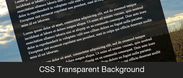
Every modern color format accepts an alpha channel, from 0 (invisible) to 1 (solid). Start with a box on top of a background image so you can see the effect:
<div id="container">
  <!-- Your content here -->
</div>
body {
  margin: 0;
  background: url('background.jpg');
}
#container {
  width: 800px;
  max-width: 100%;
  margin: 0 auto;
  background-color: rgb(0 0 0 / 80%);
}
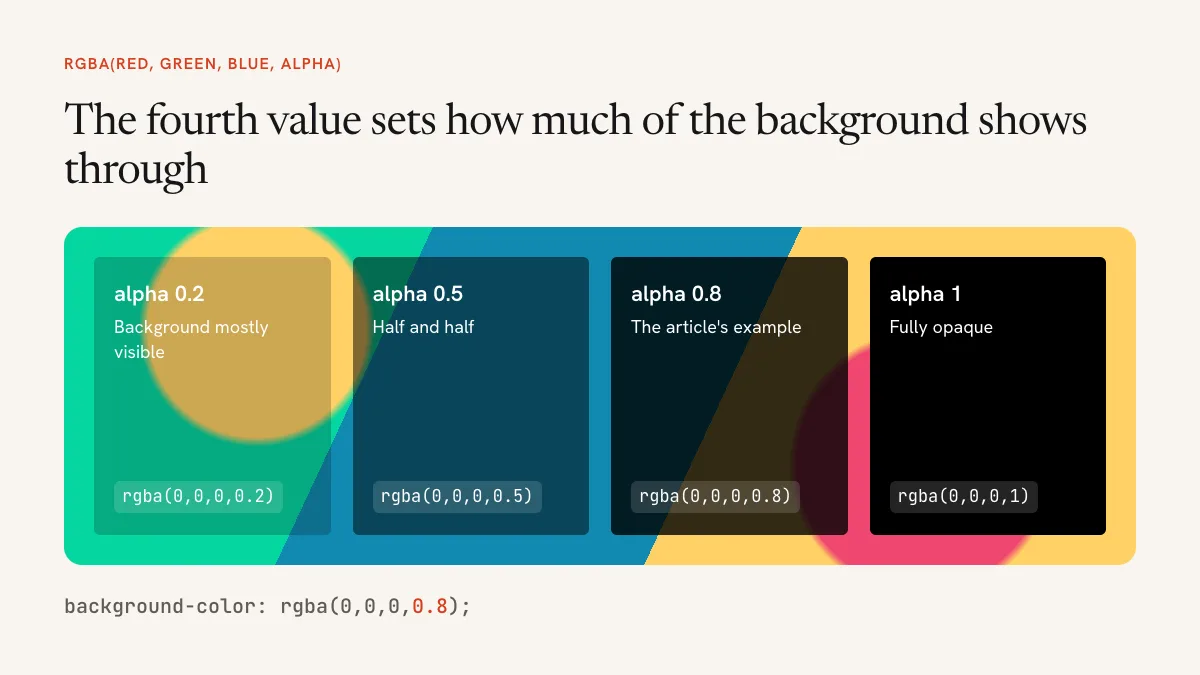
All of these produce the same black at 80%:
background-color: rgb(0 0 0 / 80%);    /* modern syntax */
background-color: rgba(0, 0, 0, 0.8);  /* older syntax, still fully supported */
background-color: #000000cc;           /* hex with alpha */
background-color: hsl(0 0% 0% / 0.8);
In the hex version the last two digits are the alpha: 80 is about 50%, cc is 80% and ff is solid. You’ll still see rgba() everywhere, and there’s no need to rewrite it. In current CSS it’s simply another name for rgb().
If your colors live in custom properties, color-mix() makes a see-through version without you having to know the color’s channels:
:root { --brand: #f25533; }
.badge { background: color-mix(in srgb, var(--brand) 20%, transparent); }
Why opacity fades your text too
opacity applies to the element as a finished picture, children included. A child can’t be more opaque than its parent, so setting opacity: 1 on the text inside won’t bring it back.
/* Text fades with the box */
.card { background: #000; color: #fff; opacity: 0.5; }

/* Only the background fades */
.card { background: rgb(0 0 0 / 50%); color: #fff; }
Use opacity when you really do want everything to fade, such as a disabled card or a fade-in animation.
Making a background image transparent
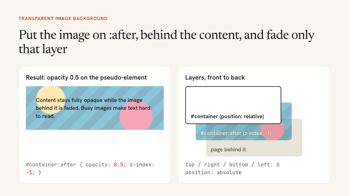
There’s no background-opacity property. The usual fix is to move the image to a pseudo-element and fade that layer alone:
#container {
  position: relative;
  isolation: isolate;
  padding: 50px;
}
#container::before {
  content: '';
  position: absolute;
  inset: 0;
  z-index: -1;
  background: url('header.jpg') center / cover;
  opacity: 0.5;
}
inset: 0 is shorthand for setting top, right, bottom and left to 0, so the layer fills the box. z-index: -1 moves it behind the content.
The isolation: isolate line is the one that older tutorials miss. Without it, the negative z-index can drop the image behind an ancestor’s background, and it seems to vanish. Isolation keeps the layer inside the container’s own stacking context.
Overlay a color on a photo
A faded image behind text often looks washed out, and detail in the photo still competes with the words. Hero banners usually do better with a dark overlay. Because background accepts several layers, you don’t need any extra elements:
.hero {
  color: #fff;
  background:
    linear-gradient(rgb(0 0 0 / 60%), rgb(0 0 0 / 60%)),
    url('photo.jpg') center / cover;
}
The first layer listed sits on top. Change the 60% until the text is comfortable to read.
Frosted glass with backdrop-filter
backdrop-filter blurs whatever is behind the element. It only shows through a background that’s at least partly transparent:
.panel {
  background: rgb(255 255 255 / 60%);
  -webkit-backdrop-filter: blur(10px);
  backdrop-filter: blur(10px);
}
Current versions of the major browsers support it, and the -webkit- line covers older Safari. Blurring is relatively expensive to draw, so use it on a small panel or header rather than across large scrolling areas.
Keep the text readable
Transparency changes contrast, and a photo changes it from one spot to the next. WCAG asks for a contrast ratio of at least 4.5:1 for normal text and 3:1 for large text. Check against the lightest area your text can land on, not the average. The WebAIM contrast checker needs solid colors, so use a color picker to sample the blended result as it appears on screen.
Common problems
- The text faded too. You used
opacityon the parent. Switch to an alpha color. - The pseudo-element image disappeared. Add
position: relativeandisolation: isolateto the container, and check thatcontent: ''is there. - A transparent border looks tinted. Backgrounds extend under borders by default. Add
background-clip: padding-box. - The image has a white box around it. JPEG has no transparency. Use PNG, WebP or SVG.
- Nothing looks transparent. Whatever sits behind the element may be plain white. Put a test image on the parent to see what’s happening.
Frequently asked questions
How do I make a div’s background transparent but not its text? Use an alpha color such as background-color: rgb(0 0 0 / 50%), not opacity.
What’s the difference between transparent and opacity: 0? transparent only clears the background color. opacity: 0 hides the whole element, including its content, though it still takes up space and can receive clicks.
Is rgba() deprecated? No. It’s a legacy name that browsers still support, and it behaves the same as rgb() with an alpha value.