Flexbox was first introduced in 2009, however as any pioneering feature it did not get recognition and due attention because of its lack of browser compatibility. It seemed to be irrelevant yet highly promising. Only several years later, it has got a chance to show its enormous potential. 2016 is marked by an upsurge of its popularity. Of course, there are still bugs and issues, yet the situation has improved dramatically. You can easily risk to use it in your projects since the significant share of the devices ( PC’s, tablets and cell phones) are managed to interpret it correctly.
If for some reason you did not have an opportunity to examine this new technique, we have prepared a round-up of tutorials and tools that help to pursue a path from novice to expert in this matter
For further reading, you can also check out flexbox snippets list of ready solutions built on the basis of Flexbox. Here you will find grid systems, code snippets, and some interesting techniques.
Master Flexbox
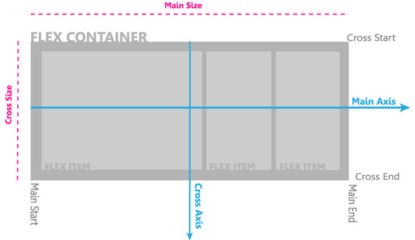
A Complete Guide to Flexbox
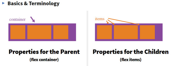
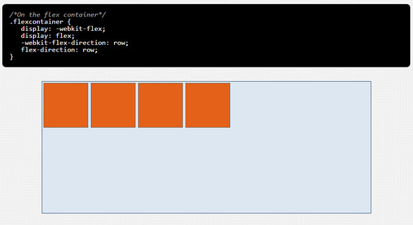
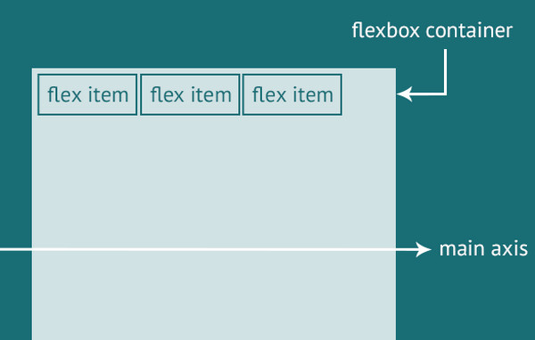
Although the guide was created in 2013, yet it hits all the essentials and is pretty relevant. It is divided into three main parts: background, basics and terminology, and properties. Here each feature is carefully disclosed and equipped with an explanatory image and a tiny code snippet.
Flexbox
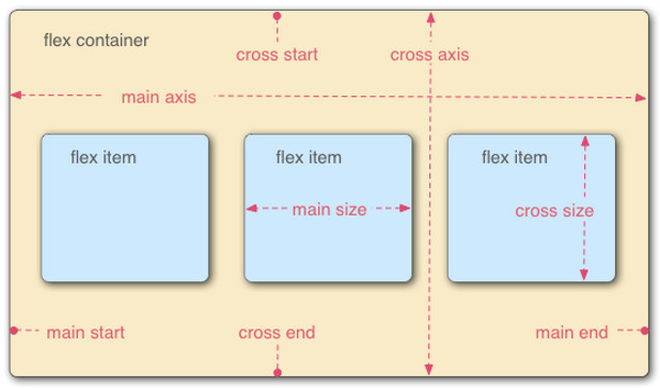
Sara Soueidan dives into the relatively new layout mode in CSS3, focusing on all the important aspects. The article covers concepts and terminology (such as flex axes and flex lines), numerous properties and much more.
A Visual Guide to CSS3 Flexbox Properties
Dimitar Stojanov mainly concentrates on Flexbox properties. He provides concise descriptions and accompanying codes to clarify such vital elements as flex-direction, flex-wrap, flex-flow, justify-content, align-items, align-content and some others.
THE ULTIMATE FLEXBOX CHEAT SHEET
The repository is a quick way to derive benefits from the flexible box module. There is a dozen of solutions presented as small pieces of codes and supporting images for sorting out such issues as moving flex items to the top/left or right, centering everything or creating flex container.
Using CSS flexible boxes
Much like the second example in our collection, this article is a comprehensive guide that uncovers all the vital aspects of the flexible layout mode. Here you will find vocabulary, examples and link to playground.
What the Flexbox?
If you prefer watching videos rather than reading posts, then this 20-video course is right down your alley. While first 13 pieces consider the fundamentals, the last 7 are aimed to practice, showing how to build various components and projects starting with navigation and ending with mobile app.
Flexbox in 5 Minutes
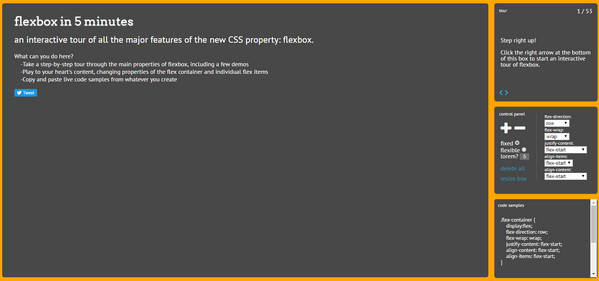
This is an interactive tour that leads you through the all main parameters of Flexbox. It is an excellent way to quickly grasp the idea of the concept and sharpen your skills.
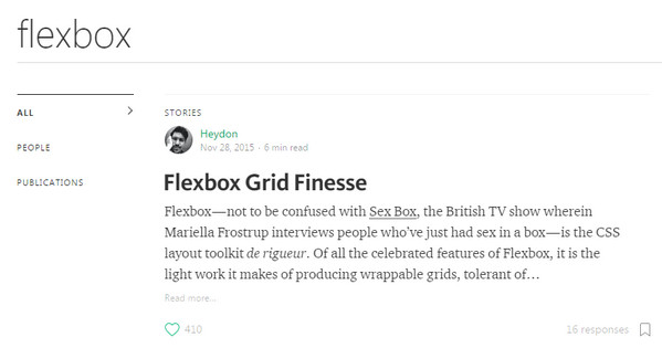
The Flexbox Reading List: Techniques and Tools
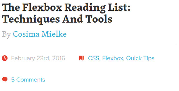
Smashing Magazine has gathered a whole collection of articles dedicated to Flexbox that were created either by the team or guest authors. Here you will find posts that will be appreciated both by novices and professionals.
Flexbox Froggy
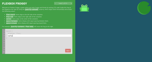
This is a small game tailored to fun. It offers developers to familiarize yourself with Flexbox in an entertaining and amusing way. Not only does it help to acquire some basic knowledge but also master the skills.
Flexy Boxes
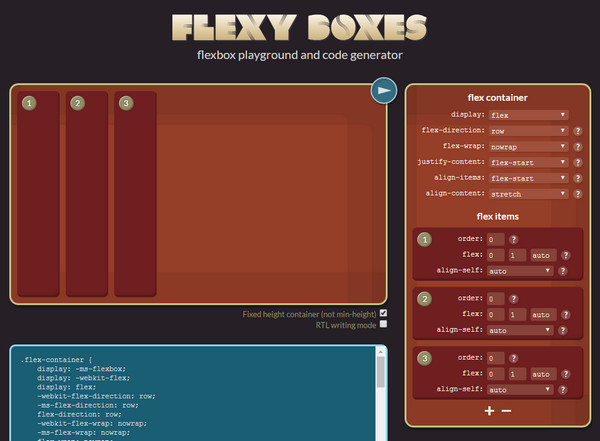
Flexy Boxes combines two instruments together. It is a playground, and at the same time, a code generator. It can be used both for educational purposes and speeding up the workflow. Use it to clarify issues and quickly generate code for your task.
Flexible Box Layout Module
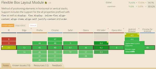
There is no use in the modern feature if you are not aware of its flaws. As any progressive technique, Flexbox experiences browser compatibility problems and this small cheat sheet clearly shows its up-to-date support. Among data you will find notes, known issues and helpful resources with a handy CSS Generator.
Tricks with Flexbox for Better CSS Patterns
If you are done with all the stuff for dummies, then you can proceed to more advanced pieces of writing, like this one. The tutorial explains methods to use Flexbox for improving various patterns, including centering, visual and cognitive order and much more.
Flexbox’s Best-Kept Secret
Sam Provenza shares with the online audience a small trick. She explains how to properly combine Flexbox and auto margin to force elements to behave the way you need to and not to break the content flow.
Test CSS Flexbox Rules Live
This is a small playground that lets manipulate with various properties from flex-direction to align-content. You can switch on and off different options as well as change a number of children to study the shifts in structure.
Modern web layout with flexbox
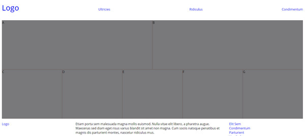
Paddi MacDonnell encourages readers to bring Flexbox into play and create a basic website layout that will meet current requirements. She describes how to correctly use containers in order to obtain a greater result.
Flexbox in Medium
Much like Smashing Magazine, Medium also has something to offer for its fellow web developers. It includes numerous articles and tutorials, ranging from beginners to intermediate level that shed the light on CSS feature from different angles.
Solved by Flexbox
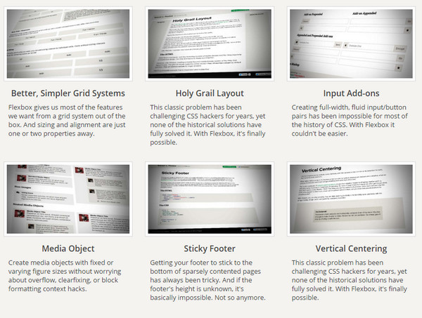
The source is all about quick and pre-made solutions for various common problems. Here you will find demos and corresponding code snippets for
- building simple grid system;
- crafting sticky footer;
- centering elements vertically;
- creating full-width, fluid input/button pairs, and much more.
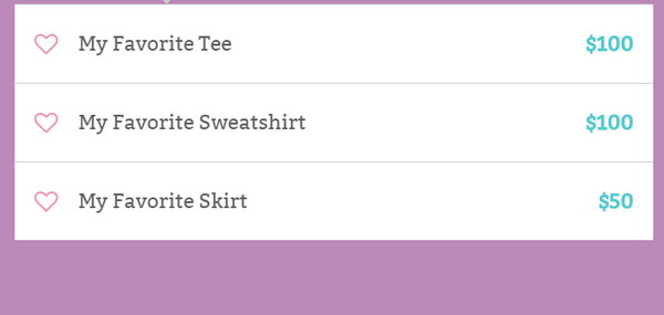
Designing A Product Page Layout with Flexbox

Levin Mejia leads through a workflow of building a typical product page layout that houses a dozen of goods using the possibilities of Flexbox. The template nicely reacts on changes in screen dimension and boasts of excellent responsive behavior.
Flexbugs
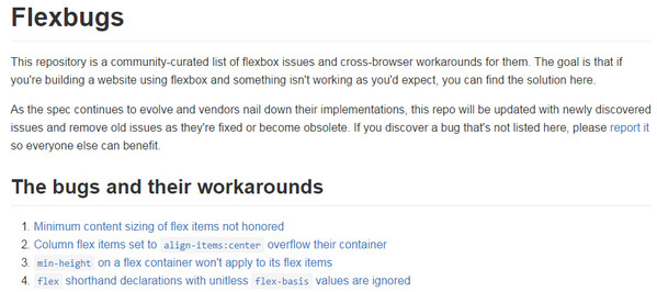
Flexbugs is just a page on Github that is a small treasure chest with various quick fixes for Flexbox issues. The repository is claimed to be regularly updated, and for now, you can find answers to more than ten common problems.
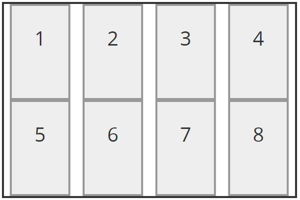
How to Make Responsive, Scrollable Panels with Flexbox

The walkthrough demonstrates a simple method of constructing a Flexbox-powered scrollable panel that will gracefully adapt to various browser screens. The tutorial is pretty short, yet it requires core competencies and understanding of fundamentals.
Conclusion
We have covered various tutorials and guides in order to set some anchors on your path of becoming an expert in Flexbox. You can go for a traditional route of burying your nose in an in-depth tutorials or try out entertaining ways to broaden your knowledge and upgrade your skills.