Today I’d like to share some 3D button styles, made with CSS drop shadow. I used a box-shadow to simulate the 3D effect and also added some CSS transitions to make it look smooth when you click the buttons. There are 8 buttons in total.
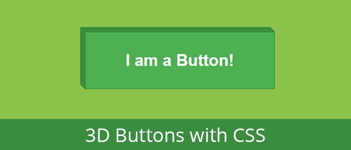
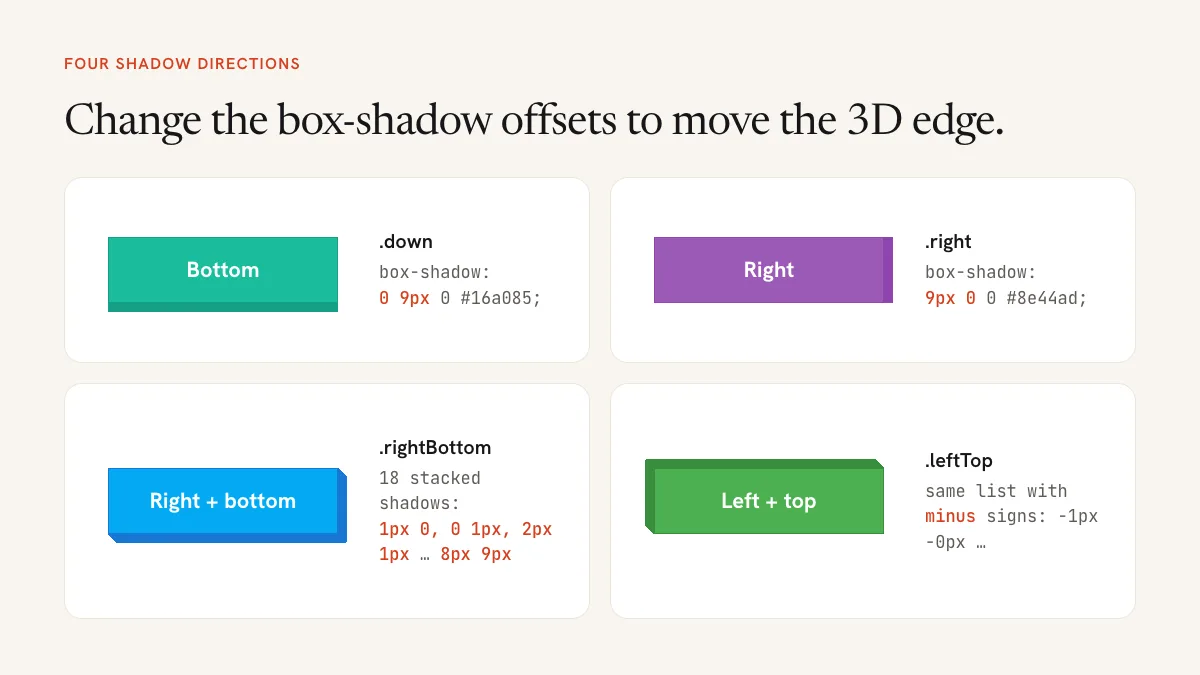
Below you can see the code for the base button and the 4 basic styles. Editing these 4 styles, you should be able to achieve the other 4. Feel free to copy the code and play around with it, and see what you come up with.
Creating the Button
The first thing we need to do is create a simple HTML button.
<button class="">I am a Button!</button>
Then we add the basic styling to make it look better:
button {
    /*  */
    position:relative;
    padding:35px;
    margin:30px;
    width:350px;
    /* Font Styling */
    font-size:30px;
    font-weight:bold;
    color:#FFF;
    }
Button with Drop Shadow On the bottom
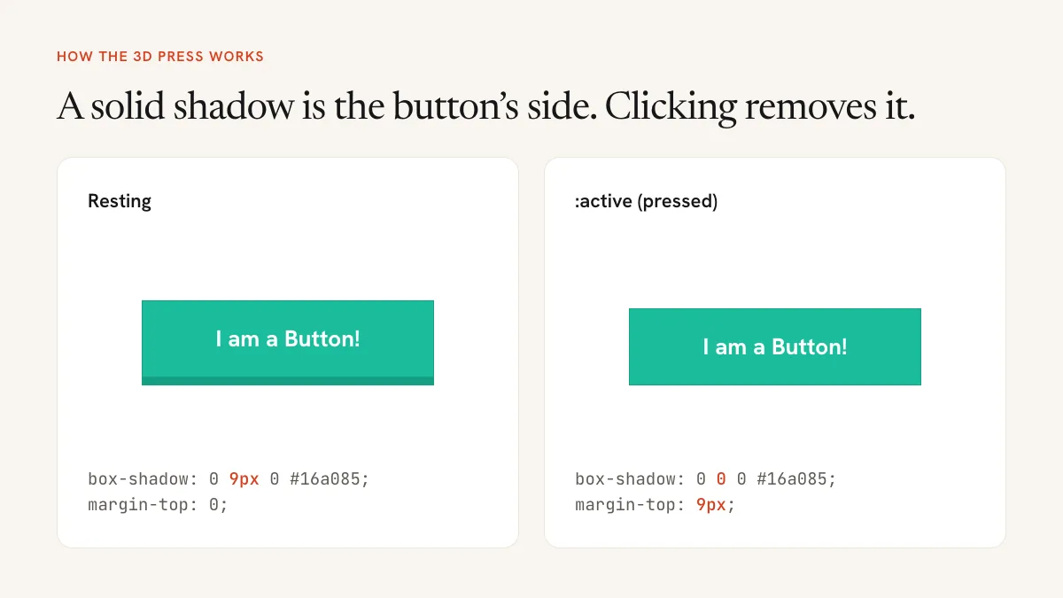
After we have the basic button styled and ready, all we have to do is add a new class, in this case, “down” and add the shadow effect to it, like so.. :
<button class="down">I am a Button!</button>
Of course, we need to style that class first:
/* Styling the Button */
.down {
    -webkit-transition: margin-top 0.3s ease, box-shadow 0.3s ease ;
    -moz-transition: margin-top 0.3s ease, box-shadow 0.3s ease;
    transition: margin-top 0.3s ease, box-shadow 0.3s ease;

    background:#1abc9c;
    border: solid 1px #16a085;

    -webkit-box-shadow: 0px 9px 0px #16a085;
    -moz-box-shadow: 0px 9px 0px #16a085;
    box-shadow: 0px 9px 0px #16a085;
}

/* When the button is clicked */
.down:active{
    -webkit-transition: margin-top 0.2s ease, box-shadow 0.2s ease;
    -moz-transition: margin-top 0.2s ease, box-shadow 0.2s ease;
    transition: margin-top 0.2s ease, box-shadow 0.2s ease;

    margin-top:9px;

    -webkit-box-shadow: 0px 0px 0px #16a085;
    -moz-box-shadow: 0px 0px 0px #16a085;
    box-shadow: 0px 0px 0px #16a085;
}
Button with Drop Shadow On the Right
To have the 3D effect on the right, all we have to do is change the box-shadow values, from box-shadow: 0px 9px 0px #16a085; to box-shadow: 9px 0px 0px #8e44ad;
.right {
    background:#9b59b6;
    border: solid 1px #8e44ad;

    -webkit-box-shadow: 9px 0px 0px #8e44ad;
    -moz-box-shadow: 9px 0px 0px #8e44ad;
    box-shadow: 9px 0px 0px #8e44ad;

    -webkit-transition: margin-left 0.2s ease, box-shadow 0.2s ease;
    -moz-transition: margin-left 0.2s ease, box-shadow 0.2s ease;
    transition: margin-left 0.2s ease, box-shadow 0.2s ease;
}

.right:active{
    margin-left:9px;

    -webkit-transition: margin-left 0.2s ease, box-shadow 0.2s ease;
    -moz-transition: margin-left 0.2s ease, box-shadow 0.2s ease;
    transition: margin-left 0.2s ease, box-shadow 0.2s ease;

    -webkit-box-shadow: 0px 0px 0px #8e44ad;
    -moz-box-shadow: 0px 0px 0px #8e44ad;
    box-shadow: 0px 0px 0px #8e44ad;
}
Button with Drop Shadow On the Right and Bottom
To have dropshadow on both right side and bottom, we’ll have to add multiple shadows to simulate the smoothness of the shadow.
.rightBottom {
    transition: margin-top 0.3s ease,
    margin-left 0.3s ease,
    box-shadow 0.3s ease;

    background:#03A9F4;
    border: solid 1px #1976D2;

    box-shadow: 1px 0px 0px #1976D2,0px 1px 0px #1976D2,
    2px 1px 0px #1976D2,1px 2px 0px #1976D2,
    3px 2px 0px #1976D2,2px 3px 0px #1976D2,
    4px 3px 0px #1976D2,3px 4px 0px #1976D2,
    5px 4px 0px #1976D2,4px 5px 0px #1976D2,
    6px 5px 0px #1976D2,5px 6px 0px #1976D2,
    7px 6px 0px #1976D2,6px 7px 0px #1976D2,
    8px 7px 0px #1976D2,7px 8px 0px #1976D2,
    9px 8px 0px #1976D2,8px 9px 0px #1976D2;
}

.rightBottom:active{
    transition: margin-top 0.3s ease,
    margin-left 0.3s ease,
    box-shadow 0.3s ease;

    margin-left:9px;
    margin-top:9px;

    box-shadow: 0px 0px 0px #1976D2;
}
Button with Drop Shadow On the Left and Top
To have the shadows on the left side and on top, all you need is to add minuses ( – ) in front of each number.
.leftTop {
    transition: margin-top 0.3s ease,
    margin-left 0.3s ease,
    box-shadow 0.3s ease;

    background:#4CAF50;
    border: solid 1px #388E3C;

    box-shadow: -1px -0px 0px #388E3C,-0px -1px 0px #388E3C,
    -2px -1px 0px #388E3C,-1px -2px 0px #388E3C,
    -3px -2px 0px #388E3C,-2px -3px 0px #388E3C,
    -4px -3px 0px #388E3C,-3px -4px 0px #388E3C,
    -5px -4px 0px #388E3C,-4px -5px 0px #388E3C,
    -6px -5px 0px #388E3C,-5px -6px 0px #388E3C,
    -7px -6px 0px #388E3C,-6px -7px 0px #388E3C,
    -8px -7px 0px #388E3C,-7px -8px 0px #388E3C,
    -9px -8px 0px #388E3C,-8px -9px 0px #388E3C;
}

.leftTop:active{
    transition: margin-top 0.3s ease,
    margin-left 0.3s ease,
    box-shadow 0.3s ease;

    margin-left:-10px;
    margin-top:-10px;

    box-shadow: 0px 0px 0px #388E3C;
}
Notice that the pressed state moves the button by the same amount the shadow was offset, 9px or 10px, and sets the shadow to zero. That’s what makes it look like the button is pushed into the page.
A better way to press: transform instead of margin
Changing margin-top on click has a side effect: the button grows taller in the layout, so everything below it jumps down by 9px. transform: translate() moves the button visually without touching the layout, and browsers animate it more smoothly too. Here’s the bottom-edge button rewritten that way, with a single shadow that grows and shrinks:
.btn-3d {
    padding: 20px 40px;
    font-size: 24px;
    font-weight: bold;
    color: #fff;
    background: #1abc9c;
    border: 1px solid #16a085;
    border-radius: 6px;
    box-shadow: 0 9px 0 #16a085;
    cursor: pointer;
    transition: transform 0.15s ease, box-shadow 0.15s ease;
}
.btn-3d:hover {
    background: #1fd1ae;
}
.btn-3d:active {
    transform: translateY(9px);
    box-shadow: 0 0 0 #16a085;
}
For a right-and-bottom edge you don’t need eighteen stacked shadows either. One shadow with both offsets, box-shadow: 9px 9px 0 #1976D2, gives a similar solid edge, and the pressed state becomes transform: translate(9px, 9px). The stacked version draws a diagonal, beveled corner, so keep it if you like that look.
Make the buttons accessible
- Show keyboard focus. Browsers draw a focus ring by default, but custom borders can hide it. Add
.btn-3d:focus-visible { outline: 3px solid #f1c40f; outline-offset: 4px; }so keyboard users can see where they are. - Check the contrast. White text on the original teal (
#1abc9c) is only about 2.4:1, well under the 4.5:1 that WCAG asks for. Use a darker background such as#117a65with a#0b5345edge, or bold text at 24px and above, which only needs 3:1. - Style the disabled state. A disabled button shouldn’t look pressable:
.btn-3d:disabled { opacity: 0.5; box-shadow: none; cursor: not-allowed; } - Respect reduced motion. Wrap the transition in
@media (prefers-reduced-motion: no-preference) { ... }if you add larger movements.
Use real buttons
Apply these styles to a <button> for actions and to an <a> for links to another page. A <div> styled as a button can’t be reached with the Tab key and doesn’t respond to Enter or Space without extra JavaScript. If you put the class on a link, add display: inline-block and text-decoration: none.
Common problems
- The content below jumps when you click. You’re animating
margin. Switch totransformas shown above. - The shadow looks blurry. The third value in
box-shadowis the blur radius. Keep it at0for a solid 3D edge. - The press doesn’t work on phones. Mobile browsers apply
:activeonly briefly. It still works, but it’s easy to miss. A short transition (0.1 to 0.15s) makes it visible. - The transition doesn’t play. A transition only runs for the properties it lists. If you press with
transform, listtransformin thetransition.
Frequently asked questions
Do I still need the -webkit- and -moz- prefixes? No. Every current browser supports box-shadow and transition without prefixes, so you can delete those lines.
Can I make 3D buttons with no shadow at all? Yes. A thick border-bottom in a darker color gives the same edge. Shrink it and translate the button on :active.
For more button and form styling, see the flat design login form tutorial.