As Jarry Cao said, Cards dominate the Web. It is on everyone’s lips. Whether you want to share a picture via Pinterest or explore a gallery of outstanding projects in Dribbble, you will eventually stumble upon Cards. They are everywhere. Not only because it is a handy way of arranging and presenting data, but also because it is not so difficult to implement. Formally, it is just a revamped, improved and more matured version of a basic modular approach. Paired with Flexbox and jazzed up with CSS-driven animations, it becomes a powerful tool that fits the current state of Web and easily steals the show. If you want to dive into this mainstream, we have assembled a collection of helpful resources for you.
First of all, familiarize yourself with the solution. And finally, take a look at our list of plugins and code snippets that will give you an actual boost in this field.
3D Fold out reveal by Andrew Canham
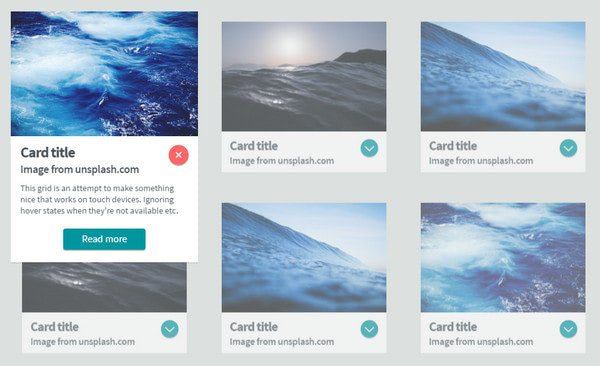
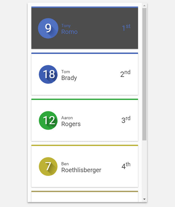
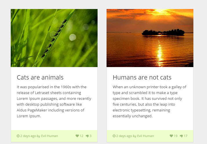
The solution is based on a flexible grid system that nicely responds to various screen sizes. Each piece of data is presented as a dynamic card that houses image, several CTAs, and description. A nice trick is an activated status of the box: it gently overshadows everything else, expands down, and reveals extra information.
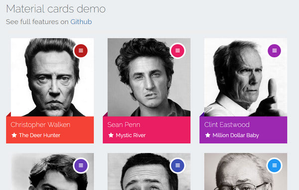
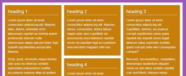
Material Cards
It is here where two main trends meet each other. The author is managed to produce an interesting idea with the assistance of Material design color palette and jQuery-powered Cards layout. Each block is supplied with a small animation that is triggered by a hamburger menu button in the upper right corner, disclosing supplementary data. They are bright, responsive and viable.
Mobile Cards By Ettrics
The artist takes a traditional route with Cards by implementing them for mobile devices. The data is arranged into vertical blocks that are lined up in a vertical order. When activated, each item takes up the whole browser screen to demonstrate further information.
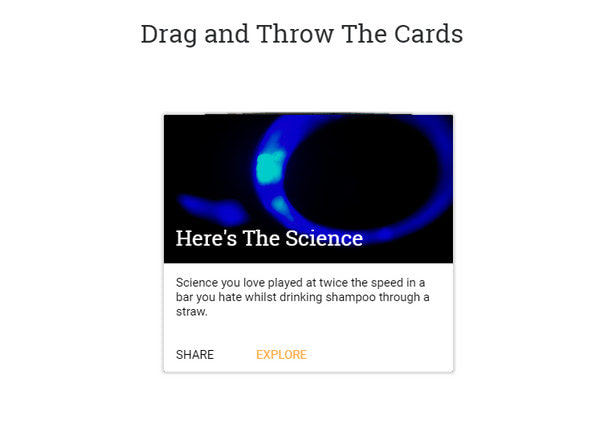
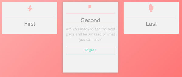
Drag And Throw 3D Card Pile By Chris Gannon
The key feature of this solution lies in its accompanying effect that makes the pile of Cards looks vivid and dynamic. You can drag and throw them away: everything is operated by the mouse cursor or finger. Another great thing is that it works great with touch screen devices.
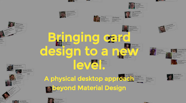
Bringing card design to a new level
Nicolay Mausz has prepared a user administration demo with the cards-centered design. You can move, zoom and group items. Each one includes image and textual data. Although the code is not polished, yet it serves as an excellent starting point.
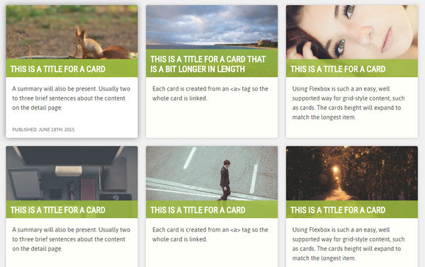
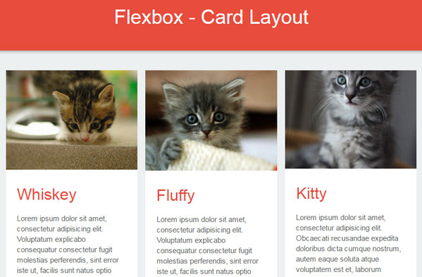
Flexbox Cards By Lindsey
Lindsey leverages several modern features: Cards and Flexbox to yield an excellent result. This standard 3-column grid quickly adapts to various screen sizes, re-grouping into two and single column layout when it is necessary and dishes up lots of data in a pleasant way. There are no fancy supporting effects; everything is static; however, the solution is clean and reliable.
Velocity.js cards layout By Tommie Hansen
Much like the previous example, the concept is merely typical. The structure is standard, and the design is neat, tidy and crisp. Nevertheless, it can be applicable for numerous projects, especially blogs and online galleries.
Cards By Carlos Salgado
Here, each card smoothly expands to provide readers with extra information. They are concise and compact and at the same time informative.
Download Cards By Evan Wieland
The project features three cards neatly arranged in one line. Each one looks clean and minimal and has two sides, the front and back, between which you can switch. The shifting is fantastic.
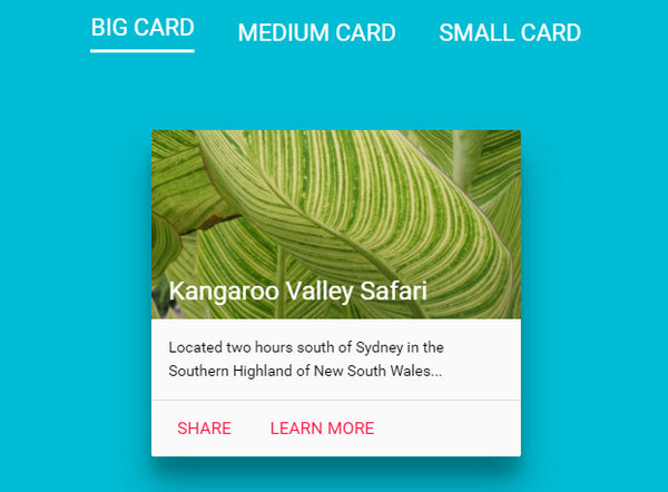
Material Design Cards By Mattia Astorino
Mattia Astorino demonstrates a metamorphosis of one card with the help of three options. Each variant can be used for different screen dimensions: thus, the biggest one is applicable for desktop monitors, the medium is well-suited to tablets, and the smallest one is ideal for cell phones.
Pinterest cards layout – JS version By Alexander Goncharov
Alexander Goncharov has created two versions of Pinterest-styled layout. The first one that is featured on our list is based on JavaScript, and the second one is purely CSS. The solution is static, yet it is pretty universal and lets mimic the design of one of the most popular photo-sharing platform.
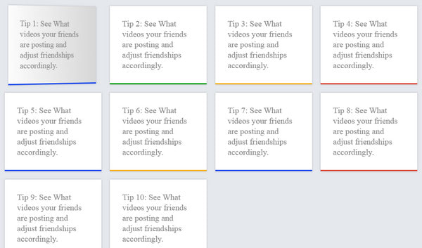
Tip Cards
The solution is pretty schematic; the artist does not go into details nor take care of design. However, he has prepared a solid ground for constructing something more complex and inviting. Each block has a flip over effect.
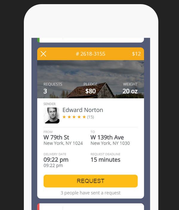
1Delivery Card Animation By Nikolay Talanov
Nikolay Talanov has skillfully put in practice Cards. His concept for mobile devices is elegant and powerful. It features properly organized structure, beautiful flipping animation, and some extra functionality.
Flexbox – Responsive Card Layout By Mynor Alexander
This is another prototype in our collection that is a mixture of Cards layout and Flexible boxes. Although it looks a bit insipid, yet the result is great. The artist is managed to build a standard design that is responsive and stable and treats data pretty well.
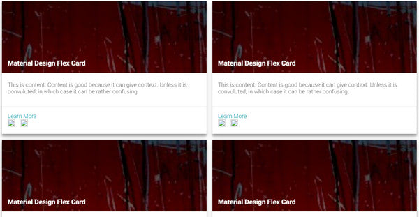
Material Flex Cards By AyeZee
This is a combination of Material design, Flexbox, and Cards. It does not have to look presentable since its beauty lies in its functionality. The solution is great and is carefully crafted.
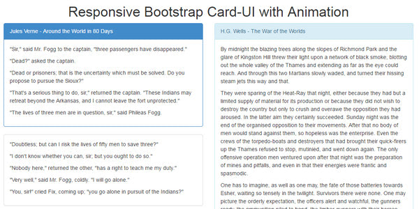
Responsive Bootstrap Card-UI By Ben
Ben has created a Cards-centric layout that is driven by Bootstrap Foundation. It is spiced up with little animations and has a responsive behavior. It places the content into boxes and arranges them into the two-column structure.
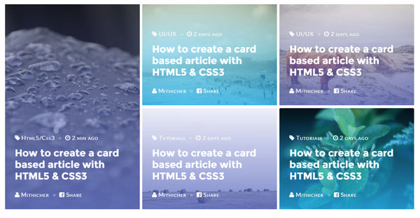
Card Article UI By Mithicher
The theme has a bright and eye-catching appearance. The posts are concisely showcased and supplied with beautiful backgrounds. It is suitable for online magazines and blogs.
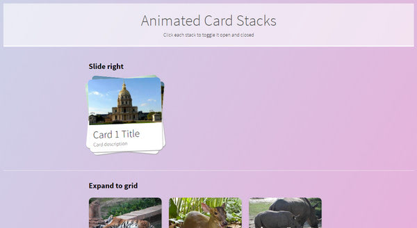
Animated Card Stacks By Chris Hutchinson
The prototype magnetizes with its dynamic behavior. There are two animations that accompany re-arranging of a pile of cards. The first one deals with three items that perfectly occupy one row, whereas the second one shows how to turn the stack into a grid in a fancy manner.
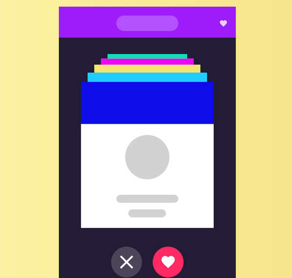
Flipping Card By mario s. maselli is a mini project for small devices, such as cell phones. The author has recreated a standard flipping animation adding a nice twist to it. You can also click on a heart icon to fav a picture or push a close button to remove the card from a pile.
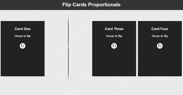
Flip Cards Proporcionales y Responsive con CSS3 by Josetxu
The solution includes fully responsive cards that gracefully adapt to various screens. Each one has two sides and an accompanying flipping transition. The author leverages only possibilities of CSS3, so that the concept is pretty lightweight.
Conclusion
Cards is a big trend. It goes perfectly well with Flexbox and Material Design, creating outstanding web solutions that naturally handle a bulk of data. It offers a consistent experience across various devices and is handy to use.