I’ve gathered eight tips for you to help improve the user experience of your eCommerce website visitors. These tips will work very well whether you’re an in-house designer for an eCommerce company or a freelance designer helping a client. They cover a variety of topics so let’s just get right into it.
1. More isn’t always better
A well-known psychology experiment took place in a grocery store. Colombia Business School wanted to study how choice effects purchases. In the store, there were two types of jam sample displays set up. Each customer who came up received a $1 upon for the jams and could sample them as well. The first display had 24 samples and had 145 people stop by, and only four people buy a jam. The second display had only six jams, and 104 people stopped by, but 31 people purchased a jam.
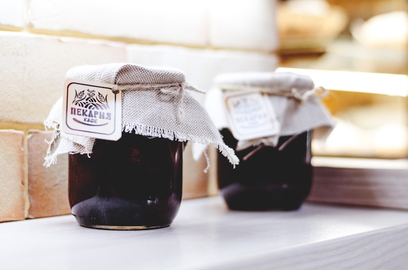
This experiment proves that fewer choices, such as choices in jam flavour, is better in converting buyers. If you’re designing an eCommerce site for copious products it will be essential to get the organization and architecture right so not to overwhelm browsing users. At the same time, it will be important to curb product options, for example, if a product comes in 25 different colours.
2. Compare products in a single place
Another group of curious scientists, Shankha Basu and Krishna Savani, wanted to study how product comparison leads to purchasing decision. The two found out that when people compare products side by side instead of one by one, they make better purchasing decisions. If you’re designing for products that are just a little different, say a company like Fitbit, it’s important to show the product differences in an easy to digest way on a single page.
3. Conduct research on your shoppers
No matter the industry, each product page will have more or less similar information such as name, picture price, details, and so on. However, it is important to find out what your shoppers care about. That will vary from industry to industry. Some shoppers will care about specs a whole lot more than a picture such as in B2B electronic components stores. Wheres high-end fashion retailers will focus more on the images instead of the price. Doing this kind of research will help you get the hierarchy right of the page. With the right hierarchy, you’ll provide a better experience to your target audience.
4. Stories sell
Significant Objects is an experiment run by Rob Walker and Joshua Glenn. They sold random thrift store-found objects and sold them on eBay. However, to each object they had a writer make up a short story about the objects. They bought over 200 items for $1.25 on average. Yet, the items sold for almost $8,000 in total. That is a mind-blowing ROI.
You don’t have to make up stories about the products your customers are selling, but you need to incorporate storytelling into how your customer will be sold online. Storytelling is compelling because it relies on an emotional connection between the product and a potential customer. That’s what you should be aiming for with your product page designs.
5. Free shipping all the way
Free shipping is important. Unexpected and large shipping charges are the top reason for cart abandonment. It’s also a very unpleasant experience that we designer want to avoid for our end-users. Free shipping is bound to improve your checkout rates and move the conversion needle significantly. It’s even truer if you also offer free returns. There are numerous reasons for it including the fact that people like to try things on, they want to touch them. And although we all know that shipping costs money no one likes to pay for it as it’s an added fee.
6. Out of stock shouldn’t stop anyone
Your eCommerce clients will eventually have out-of-stock items. They will either be able to fulfil the orders a little later or not. But that doesn’t mean nothing can’t be done. If your client can meet the orders in a little while and they know the inventory is coming, let the customer order the item. Yes, while still display that the item is out of stock at the moment. I’m not telling you to lie. But instead of having a dead-end, allow them to preorder it and just tell them when it will be available for shipping.

If your client cannot easily predict if an out-of-stock item can be brought back, it’s still not the end of the world. Have an email signup form instead of that the client can collect in order to token track of demand. This way, if the specific item isn’t back in stock, another similar item might be, and the client could email about it instead. It’s also a great gauge of demand.
7. Product ratings are good for SEO
People heavily rely on product reviews when buying anything online. It’s no surprise. After all, you can’t try the product, you can’t touch it, you can’t even see it until you have it. Online returns can be tedious too. Product ratings are an excellent tool for new customers already on your website. However, they are also useful for SEO. Product reviews continuously update your website, which search engines like. Website tools with reviews also rank higher and get more clicks.
8. Provide relevant suggested items
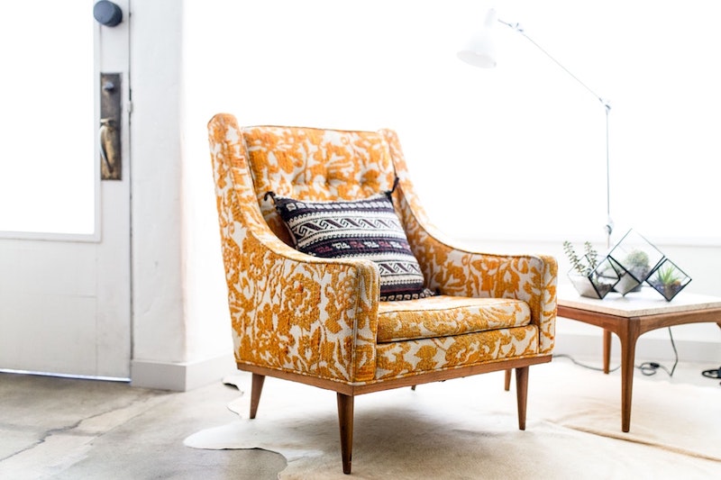
There are two types of recommended products you can add to a product page. You can add related items or similar items. Based on research, it will help improve user experience if you provide both. For example, if I am looking for a sofa online it’s going to be important that I see two things. First, it’s going to be crucial for me to explore similar items such as sofas that are similar in shape or style. If you do this on the product pages, you will eliminate barriers for your users because they can now quickly browse from where they were instead of going back and forth between the catalog pages. The more comfortable you make the browsing experience, the better.
However, there is also the second type of suggested product, the related items. Continuing with the son example, say I am finally comfortable picking a sofa for myself. It might be likely that I might need an armchair, a footrest a coffee table or an end table. Although you can’t predict what the shopper needs you can provide them with suggestions. Hell, the users might just buy an armchair with the sofa because they go so well together even if they weren’t originally planning on it. All you want to do here is again allow the users to browse freely through items that might be of interest to them.
Conclusion
I hope that these UX tips will help strengthen the user experience of the eCommerce project you’re currently working on. If you have any UX tips for eCommerce designs feel free to share with us in the comments!