By now, millions of companies have put numerous efforts in making sure that customers can access their websites from any sort of mobile device. So, it’s clear, we are living in a mobile age, and it will continue to become dominant with each passing day.
For any online business, having a mobile presence is extremely important for attracting new customers while incubating the existing ones and expanding their business. Mobile is a fundamental part of today’s business scenario, so providing a world-class mobile experience is all we can do to fuel our business growth while satisfying our customers. In the early days of e-commerce, sales were considered to be the only metrics of success, but now, we have entered the mobile era where companies have no option except to create innovative ways to engage their customers on the go. By prioritizing the mobile web development, we actually build an environment where engagement can occur and customers keep on returning. Dedicated time to small-to-large business projects can increase the benefits in a short time.
However, creating a mobile web design that “wow” customers instantly is followed by an effective strategy. If you want more customers to come to your website and purchase your products using their smartphones, some tech improvements should be there that can actually help you move the needle. Having a compelling strategy on board will help you accomplish this goal and will help you giving an edge to your mobile presence. In this post, we have discussed some best of breed strategies that will help you design a mobile website that drive maximum sales, conversions, and customer satisfaction. Let’s know about them in detail.
1. Evaluate Your Website Needs
Businesses incorporating mobile websites start with analyzing the needs of their websites along with the components that need to be added. For this, start analyzing the scenarios like whether it’s a brand new website that needs to be accessed from both desktop and mobile devices. Or you are simply going through a redesigning process, including a new mobile website.
Each scenario has its own set of requirements. Pick the one that best suits your needs and start designing accordingly.
2. Avoid Just Scaling Down Your Desktop Site
Designing a mobile site is completely different from desktop sites. In fact, there are designers who only focus on popular devices and their screen sizes, such as iPhones, Androids, iPads, Laptops, etc. The main problem with this approach is that it only addresses those devices that are known to the world while burying down the rest.
However, one of the biggest virtues of responsive design is that it adjusts automatically based on the device being used to view the website. Here, the design dictates the media queries and breakpoints. On the contrary, if you only scale down your desktop end, you are actually penalizing your users for using mobile devices. Remember to check for spam your newsletters, it’s an important medium of communication.
A website designed using a responsive approach renders the same HTML to all devices, and CSS helps in presenting the content more efficiently. HTML dictates the order in which elements should be rendered based on the device. For example- on a desktop, menus must be displayed at the top so that visitors can navigate effortlessly. On mobile devices, it’s the content that reins and catches the attention. So, you don’t need to load the menu first. For this, you can better opt for a collapsed or simplified menu located at the end of the page.
3. It’s Scrolling That Prevails
Many digital experts and marketers have already come to the consensus that people love scrolling over clicking. In fact, many usability studies have also shown that it’s scrolling that results in faster content consumption than clicking. Many websites are catching up with this trend, so make sure you don’t leave behind. Though scrolling rules, these days, for all the obvious reasons. We do need some web pages with “click” functionalities to make interactions to happen. These pages involve contact forms, transaction completion forms on e-commerce websites, or anything where sequential information is needed. The scrolling gains popularity because of the speed, ease, and flow it offers to uplift the engagement level of the visitor.
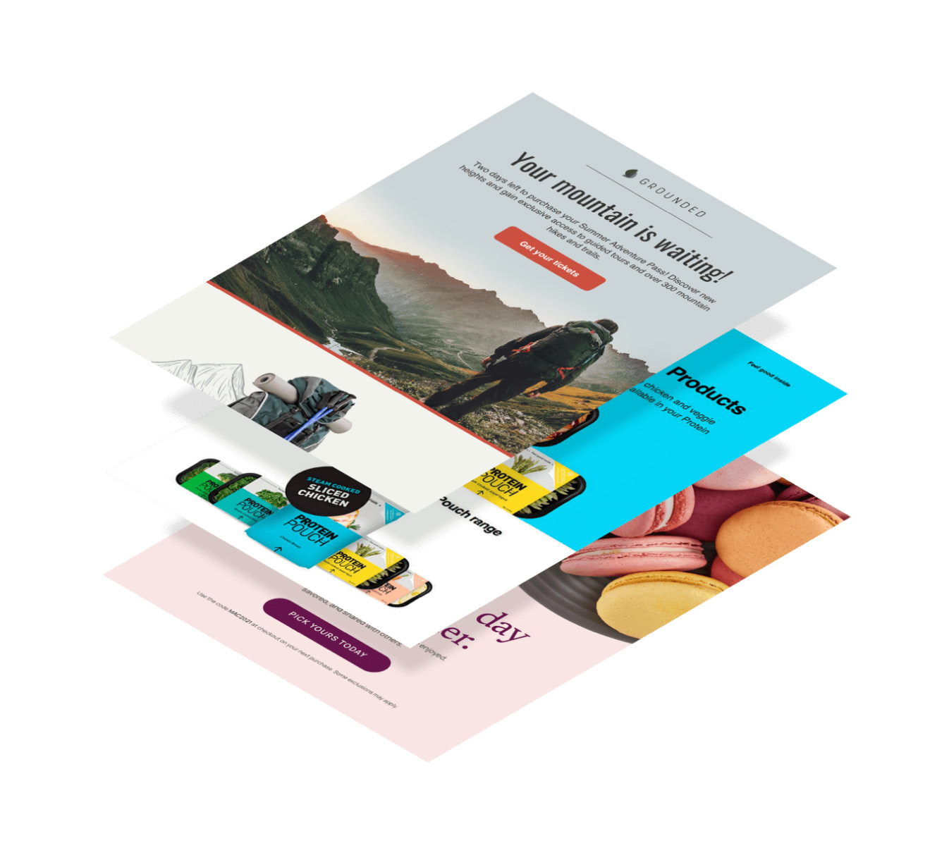
This seamless experience is just as crucial in email newsletter design. By carefully considering how content is presented and how subscribers interact with it, you can create newsletters that are not only visually appealing but also highly functional.
4. User Experience is a Must
It is extremely important to kick start your mobile web design strategies by focusing on your users. Mobile is all about the experience, so make sure you emphasize it while designing for mobile. For this, go in deep with your users to understand how they want to interact with your site, what experience you want to make them feel, at what stage you want them to act, where you want them to go, and so on. Your design must offer them a seamless and natural browsing experience so that they leave with a feeling of satisfaction and delight.
5. Strong Calls-to-Action
While designing your mobile site, make sure it has strong calls-to-action on every page. Businesses can easily capitalize on this strategy by designing notable and clickable buttons. Also, these buttons can make stand out by using eye-catching colors or by increasing their size a little bit. For an added edge, the buttons can be designed in such a way that they can be found easily without forcing the user to scroll the entire page.
Conclusion
If all the information provided above is bookmarked by you, then you can be sure of more mobile purchases, increased conversions, and long-term business profits.