Researchers from Yale, Stanford and the University of Michigan set out to determine if people would spend more money when presented with simple options or with more complicated ones. As you can guess, the simple options won out. But you don’t even have to read a scholarly journal to see that simple is popular. Take a look at the most popular website in the world, Google.com. It really doesn’t get simpler than a white background, a logo and the text box does it?
Yet when it comes to our websites, there are some of us who prefer to take the complicated and sometimes expensive routes. We see something on another site that we just have to put on our own. Or, worse still, we see our competitors’ websites and want to include everything they have and more. This is not necessarily the best approach to take. When building our website we want to take the KISS approach, but in this case we want to, “keep it simple and straightforward” because when websites are complicated people find them confusing. When you confuse people, they aren’t going to trust you. Some of the best web design agencies today are very much aware of this and work hard to keep your website simple and visually attractive.
So now comes the challenge. It’s time to take a look at your website to see if it is too confusing with a really easy baseline test.
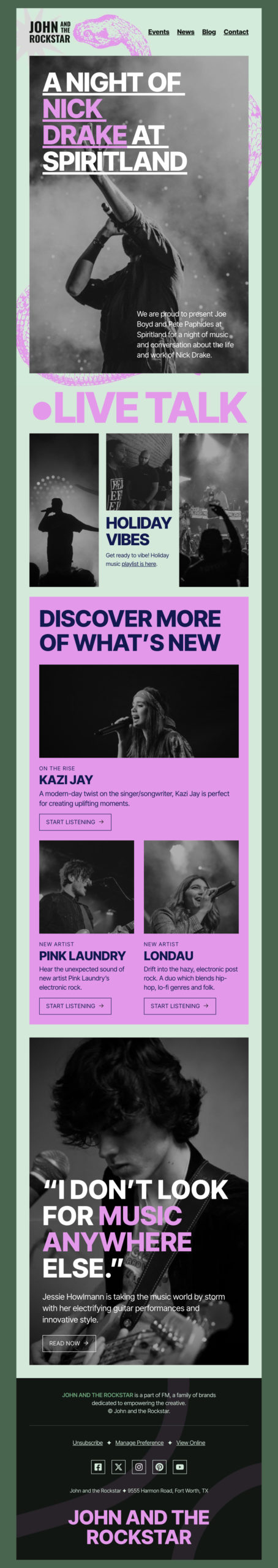
You use too many fonts and too many colors
Typography is cool, and with so many different web fonts out there to choose from it is easy to get caught up in using different ones on your site. Your site should use no more than two, readable typefaces. This will help keep the information on your website focused and easy to read.
While you are looking at your fonts, make sure that you aren’t overdoing the colors as well. The best web designers try to keep the color palates they use to a minimum as to not draw emphasis away from things.
Everything is “important”
It’s common to want to put the most important things on your homepage, but that means they have to truly be the most important things. If you attempt to cram everything onto your homepage, everything is calling out for attention and nothing winds up capturing your visitors. Your website is not only going to look bad but it is going to confuse visitors as to what they should be focusing on. If you have trouble deciding what needs to get trimmed from a page, use a tool like Crazy Egg’s heat map to see what gets attention and what doesn’t.
Cluttered navigation
One of the most tell tale signs that your website is confusing your visitors is when it is hard to get to where you want to go. Certain techniques like drop down, or accordion style navigation make pages hard to find. Multiple menus have the same effect. If a person doesn’t know which navigation bar to use or under which tab the right submenu lies then they are going to leave your site. Limit navigation to just a few links that come from one menu.
The purpose of your site is unclear
When a visitor lands on your website they should immediately know what you do or what you sell. This isn’t a time to get into specifics by listing every product, service or piece of content. Your site should immediately make you niche clear to your visitors and it should be obvious as to what you do. That visitor should immediately feel comfortable and know that they are the target audience for your website.
You have high bounce rates
There is no excuse to not have an analytics tool capturing data on your visitors anymore, after all Google Analytics is free. One of the metrics that can help clue you in to the fact that your website is confusing is the bounce rate, the number of visitors who navigate away from your site after viewing only one page. True, some people will stumble across your site on accident; but that should account for only a small number. If you notice that people are leaving your website after one page it is likely because they are confused as to what you do or where they an find what they are looking for.
Even after looking over these five elements if you are still unsure if your website is confusing the most sure fire way to tell is to watch someone use it. Ask a friend, family member or even a colleague to go through your site and watch how they interact with it. You can even ask that they perform certain tasks like fill out your contact us form or find a specific page. Nothing can be more telling than seeing someone use your site in a live demonstration.