Every work of art, either a website or a poster, immediately leaves a first impression on the observer. In most cases, the first impression is also the one which lasts the longer: so in order to immediately grab the attention of the user, you have to create an outstanding design.
That’s why when you are working on a project, you should always bear in mind how important typography is.
Indeed, a good use of fonts can definitely improve the overall look of the design, while a bad choice can negatively affect the final outlook.
Fonts have the power to create certain atmospheres, they can reveal information about the company behind the site and they can even boost, or damage, the image of a brand.
A good use of typography doesn’t only mean a good choice of a font; it is a wider concept which also refers, for example, to the ability of mixing fonts and setting the right backgrounds.
Therefore, in this article I am going to show you some example of good use of typography and some of bad use.
Let’s start.
NEW VENTURE SCOUTING – Bad Example

The first example we are going to see is “New Venture Scouting (NVS)”, a company which wants to connect startups with established corporations.
The website features some good typefaces, but the problem is that too many fonts have been used here: one of the reasons of this may be that the processes of design and development have been carried out separately.
From the homepage, you can see that the mission of NVS is declared with a slab serif font, Jubilat, which is paired with Open Sans, used to write the name of the company.
A bold slab serif font together with a humanist face, Open Sans, creates a wonderful effect and contributes to give an idea of NVS as a solid brand.
The problem is that, besides Jubilat and Open Sans, two other fonts appear: the sans serif Proxima Nova is used for the navigation panel at the top of the page and Arial is used for the body text.
What I really don’t understand is why Arial has been introduced when Open Sans was already being used: Open Sans is more stylish and it also has a wide range of heights. At the same time, there was no need of Proxima Nova.
The result is that, all over the website, there is a mix of four fonts, which are used without clear rules and a precise hierarchy.
Usually, such an outcome happens when different designers and developers work on the same project without a proper coordination.
So, from New Venture Scouting website, we can understand that not only the choice of fonts is important but also the interaction between different typefaces matters.
UNITED STRANDS – Bad Example
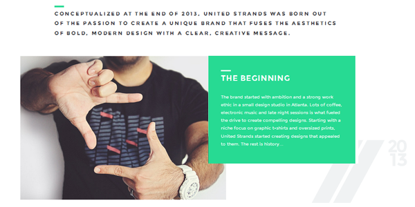
“United Strands” is an Atlanta based company which sells t-shirts online. Differently from the case of New Venture Scouting, in this website the designers used just one font: Montserrat. They could have used similar and more popular fonts such as Gotham or Proxima Nova, but they opted for a particular typeface to create a unique site and to give a smarter look to the company.
Anyway, even in this case there is something wrong with the chosen font. Indeed, Montserrat does not have italics: that’s why it is more suitable for headlines and for display works.
However, in this website, Montserrat has been used for all the body text and the direct consequence is that in different pages there are examples of “false italics”. “False italics” happen when a web browser can’t find the real italic of a word, because it doesn’t exist, and it tries to create it by slanting the original font at a certain angle.
Of course, faux italics are not good to see and, exactly like an excessive mix of fonts, they can diminish the overall website design.
DRAGONE – Good Example
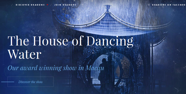
Let’s now see an example of good use of typography. The website showcased is the one of “Dragone” an Italian company which organizes dancing and entertaining shows. In a period in which the main trends of web development are flat or material design, Dragone’s website uses some great background images to create a magic atmosphere.
Together with the images, we can see the presence of an elegant and delicate, but substantial, font: “Playfair Display”. I think that the font used is perfect because it is in complete harmony with the changing images of the background and it also gives a minimal and graceful aspect to the site. The use of a serif font contributes to emphasize the professionalism of “Dragone”.
Moreover, although there is some text on top of the scenographic images, legibility is not a problem. Indeed, the designers paid attention to create a proper contrast between the words and the photos so that the font could stand out. The size and spacing is also a best practice for those looking to ensure typography is accessible to people with vision impairments.
The more careful observer can notice the presence of a second font: the sans serif Futura. It is mainly used for the headlines of the smaller navigation menus. However, the combination of these typefaces does not create any problems because they go well together.
MARIE GUILLAUMET – Good Example
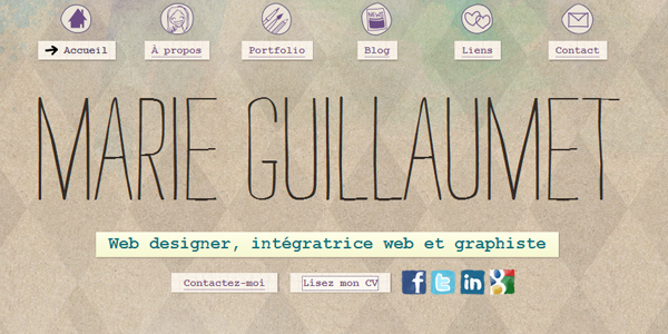
In this example we are going to see the personal website of Marie Guillaumet, a French web and graphic designer.
At first sight, your attention is grabbed by the name of the designer: it is written with a typeface which simulates the hand-writing. This unnamed font has the merit of evoking the idea that the designer really created the website by herself. A sense of authenticity and singularity is spread all over the website thanks to the main headline and several annotations which, once again, simulate the italic hand-writing.
These handwritten fonts go very well with the icons, which are in a hand-made style too.
From this example, we can understand that, when creating a site, it is important having a coherent design project which concerns typography but also all the other aspects of a website such as icons or layouts.
CONCLUSION
Typography is one of the most important aspects of every design process and you should master it. So, here are a few tips you should remember:
- Always check that the text can be read without efforts.
- If you use multiple typefaces, try to set a precise scheme and stick to it.
- As far as the font for the body text, look for one which has italic and bold styles.
- Sometimes it is better to avoid the most common typefaces in favor of more unique fonts.
- If more designers are working on the same project, try to coordinate them as best as possible.