With such big names as Foundation or Bootstrap templates, it seems that there is no place for other small and less powerful grid systems. However, not every project demands a bunch of functions and properties that are delivered by default with each of this product. Some concepts (especially the trivial ones) just need a viable base that is tidy, simple and responsive.
There is no point in wasting precious resources to build a one-page website or overloading the portal with a bulky skeleton when you need to showcase a ton of images via a traditional matrix style arrangement. Sometimes minimalist starting kit can do a trick. While it is not universal yet it can give a project a much-needed boost.
We have compiled a list of 20 flexible, reliable, and fresh grid systems that despite being as light as a feather have an ace up its sleeve.
Pintsize
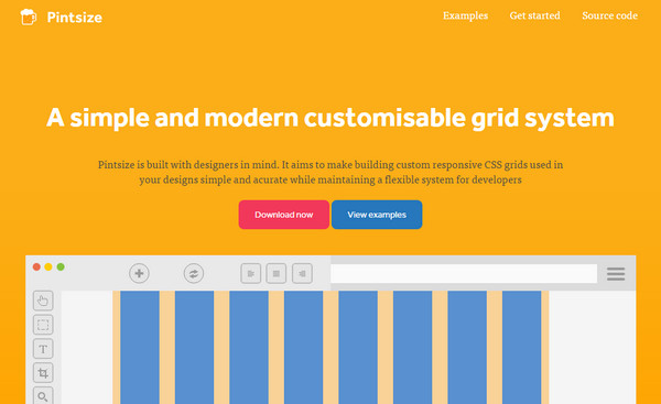
Pintsize‘s primary advantage is that it is pretty lightweight. This aspect makes it an excellent choice for the majority of content-intensive interfaces. It is flexible and easy-to-implement. Use it to compose an optimal and well-balanced base for your project.
Bulma
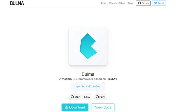
Bulma has what it takes to become a great instrument for modern websites that should deal with a ton of screens of various sizes. It is powered by Flexbox, a new and high-end layout mode in CSS3. This feature makes the boilerplate more natural and predictable in adaptation to different dimensions, yet imposes some restrictions when it comes to browser compatibility.
Flexbox Grid
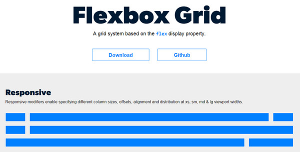
Much like the previous example, Flexbox powers the Flexbox Grid. It is an entirely responsive grid system that helps to create modular layouts for every occasion. Thanks to numerous well-thought-out modifiers, you are able to specify column sizes, alignment, viewport widths and much more.
Milligram
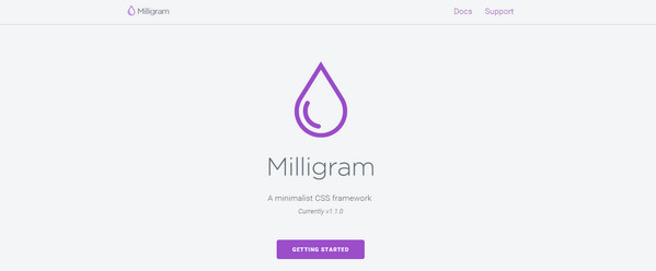
As the nameplate claims, the foundation is so lightweight that it is almost imponderable in the project. It is highly minimalist, but at the same time, functional and practical, offering owners exceptional performance. It includes all the core styles to get down to business.
Concise CSS
Concise CSS embraces the powers of SCSS to improve productivity. It can be extended with the help of pre-built add-ons. Although it is rich in ready-to-use styles and components, yet it is still pretty lightweight so that it won’t overload a website. The CSS can be used directly on a bootstrap builder.
Neutron
Neutron is an elegant and mighty SASS-based grid system that is applicable for different types of interfaces. Not only does it have a responsive behavior but it also quickly adapts to various changes in a structure. It is flexible from different angles. It has a clean and intuitive code that allows the developer to adjust it according to requirements.
spaceBase
spaceBase is another SASS-driven boilerplate in our list. It offers tidy and valid starter files for building any project. Its key features are
- optimization for fast working;
- mobile-friendliness;
- fluid grid;
- predefined UI components such as buttons or lists;
- utilization of object-oriented CSS.
Avalanche
This SASS grid system does not differ from any other mentioned above: it is also responsive, lightweight and super clean. However, it has some character traits such as:
- accurate breakpoints based on real-world mobile devices;
- straightforward media query names;
- infinite nesting;
- BEM-syntax;
- clutter-free skeleton.
Kube
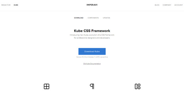
Kube comes with all the integral components of the user interface, including typography, grids, blocks, forms, tables, buttons, notifications, labels, helpers and even mixins. The CSS framework leverages sophisticated techniques such as Flexbox in order to provide fast performance.
Layers CSS
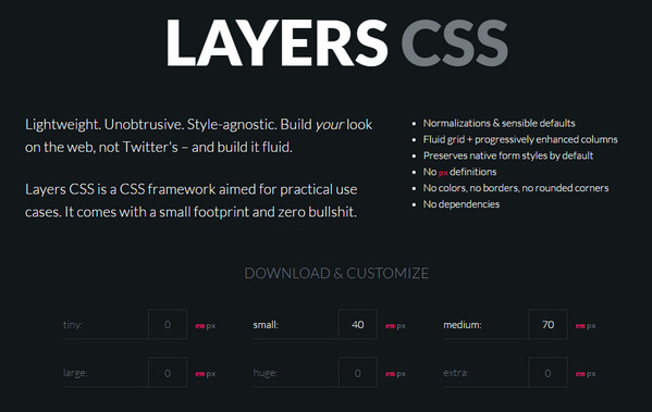
For such a small framework, it is surprisingly multifunctional. It ships with grids, lists, tables, tools, forms, and samples. While it does not look as ‘serious’ and professional as the majority of listed above, yet used wisely, it is capable of equipping a website with a safe and adaptive backbone.
Picnic CSS
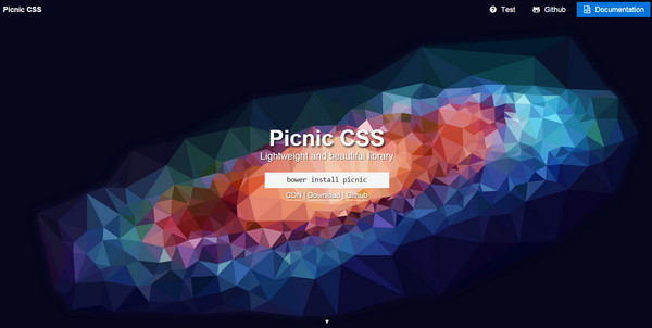
Picnic CSS is a tiny library based on a modular approach. It smartens up and prettifies HTML structures with ease. Not only does it possess many variables and placeholders but it also offers developers to charge interfaces with subtle and fancy transitions. It goes well with concepts oriented at cell phones.
Siimple
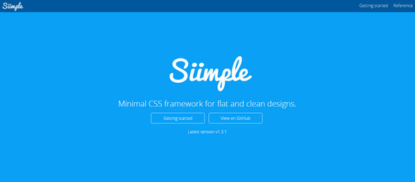
Siimple is aimed to generate clean, flat, and responsive underlying infrastructures with a minimal use of resources. It is efficient and productive though it weighs just 5kb. Turning vast possibilities of SASS/SCSS to its advantage, it offers developers a tremendous boost.
BlazeCSS
BlazeCSS is claimed to be a mobile-first, modular and highly customizable instrument that let’s build interfaces of various complexities in short order. Including essential components, mixins, and variables, it serves as an optimal starting point for crafting front-ends.
Juiced
Juiced is delivered with an accurate mobile targeting, custom column order, a dozen of alignment options, hassle-free HTML and CSS files. It is built on top of a flexible layout so that it skillfully accommodates different screen sizes.
Rebar Grid
Rebar Grid is an alternative to powerful Bootstrap. It is claimed to be more flexible and less weighty. It speeds up the development of responsive interfaces, keeping HTML clean and CSS organized. It leverages SASS and Stylus so that it works well with Libsass 3.1.
LostGrid
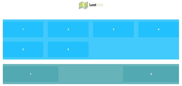
LostGrid is not so lost as it may sound. It allows building complex masonry, classic vertical and original waffle grids that will carefully treat all the content. It is a fractional grid system that employs calc() to generate a structure. It collaborates with all the famous preprocessors.
MiniGrid
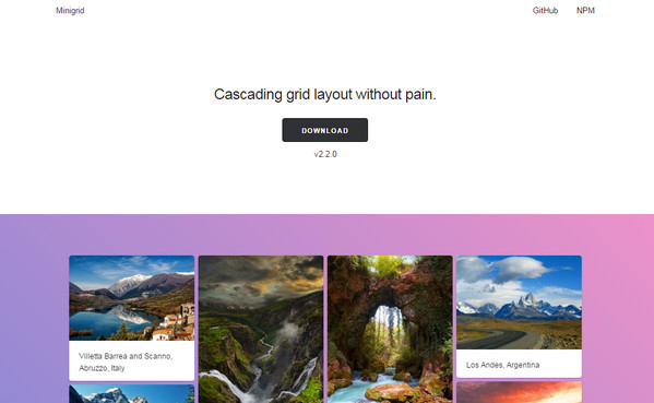
MiniGrid means mini. It is extremely conservative with resources thanks to a weight of 3kb. It is intended to equip the project with a sleek and robust cascading layout that places data within cells. It is suitable for building grid-centric interfaces that have to handle a plenty of multimedia content.
Sierra
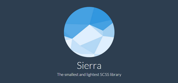
Although the title states that the framework is the lightest and the smallest one, however, it will occupy nearly 9kb of your free space on a disk and that in comparison to several listed above examples, sounds a bit heavy. In other respects, it is not inferior in its potential. It is fully customizable; it has a ton of predefined components such as buttons, forms, checkboxes, typography, tables, tabs, badges, paginator, etc; and it is mobile friendly.
Gridlex
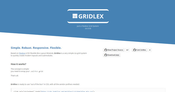
Gridlex owes its functionality to several factors. First of all, it is a Flexible Box Layout Module that supplies it with a nifty responsive behavior. Secondly, it is a small list of submodules. And finally, it is a simple syntax that can be modified, and improved by any novice developer. It is ideal for prototyping modern Cards-inspired pages.
Bricks.js
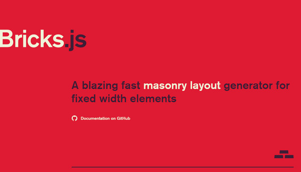
Bricks.js is some kind of a generator that helps to create traditional masonry layouts. It does not require any HTML markup or CSS stylesheet; all you need to do is to select a number of bricks. You can hit ‘Repack’ button to choose a preferable variant.
Conclusion
Although they are not as mighty as some famous representatives, however, they are lightweight, fast and have an excellent arsenal. They offer a starting kit for crafting standard pages within minutes. Maybe they do not fit every project, yet they certainly have its audience.