With an exponentially growing iOS and Android markets and undeniable fact that apps are sold like hotcakes, if you are still uncertain in what direction to move or just want to try yourself out in a new sphere, it is definitely time to start your career as app UI designer. Hiding numerous benefits and perks, this direction is one of the most appreciative, and at the same time, challenging. Although app prototyping involves some restrictions when it comes to adaptation to smaller screens of tablets, phablets, and smartphones as well as complying with requirements and guidelines of famous platforms, yet it still provides the same exciting experience as website development. For making you feel more comfortable and confident in this matter, we have prepared a list of free app interface and dashboard mockups that can come in handy for various purposes.
Blog Apps
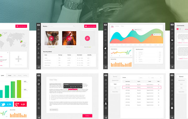
Bagus Fikri presents a series of 8 neatly reproduced blog app interfaces that cover omnifarious stuff well-suited for prototyping such kind of projects. There are vibrant graphs, statistics/analytics blocks, handy tables, intuitive ultra-narrow icon-based navigation, map widget and much more.
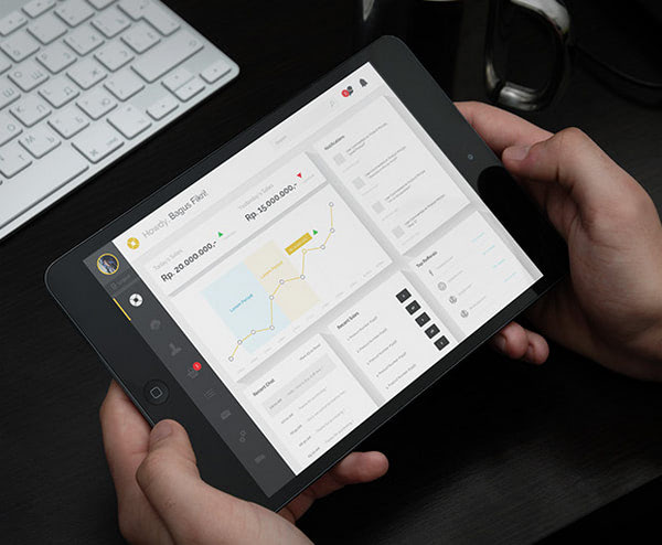
eCommerce Admin Dashboard is constructed with modern and trendy ‘cards’ design in mind. The mockup has a well-organized structure with a well-thought-out amount of white space and beautiful coloring that give the interface an intense open feeling and strong businesslike appeal.
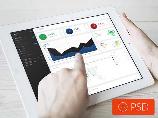
Wody – by Mohamed Said is a professionally crafted PSD template of a web app dashboard. Being neatly split into 2 parts, the mockup, as befits majority such designs, includes a clean and robust navigation sidebar, which sits on the left and occupies the third part of the browser screen, and a content block, which takes up the rest of the screen and displays statistics in an understated manner.
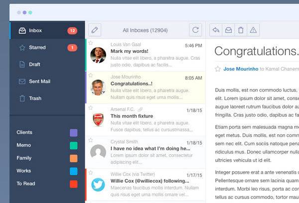
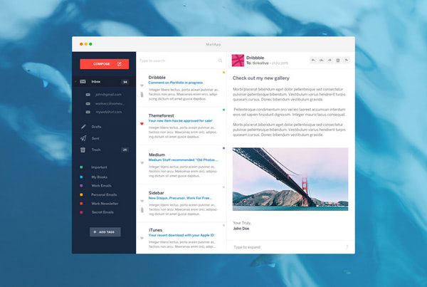
Mail App by Kamal Chaneman features all integral stuff that are needed to a simple mail app to function promptly and correctly. Here you will find intuitive vertical navbar, search input, a bulk of elegant contour icons, well-balanced blocks of content and some other tiny helpful elements.
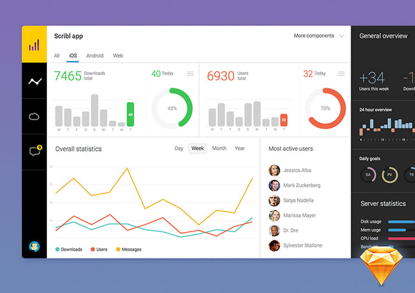
Dashboard Sketch Freebie by Ante Matijaca
Skillfully playing on a contrast between black and white as well as implementing a generous amount of white space, the designer is managed to achieve significant results with the concept, making a mockup absolutely refined, clean and sleek.
Work in such a well-balanced app dashboard will be a pure delight.
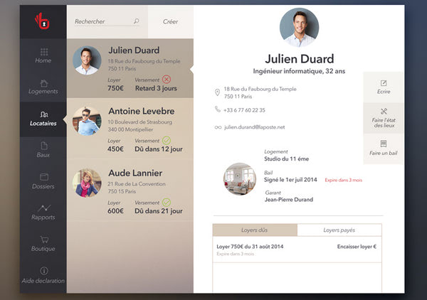
Property management app, free iPad PSD by Katka L. Pot
The subtle app interface has a warm feeling mainly produced by a brown shade. Carefully organized layout succeeded in presenting all essential stuff in a 3-column body and not overwhelming readers with raw data. Color palette as well as color differentiation used for highlighting selected areas are certainly carefully planned.
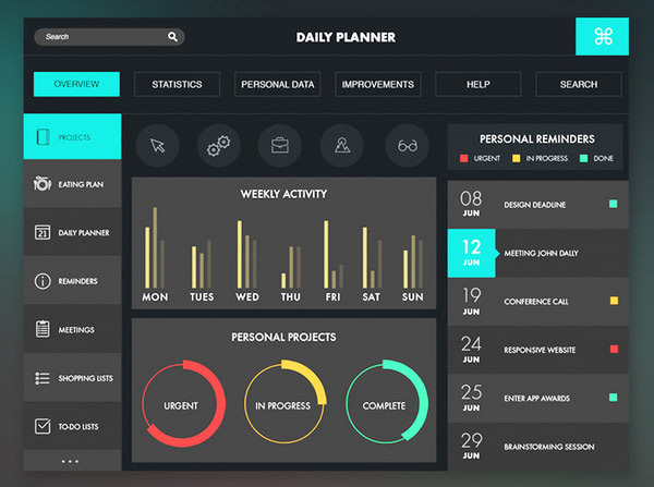
Data Analysis by Jana de Klerk demonstrates a brilliant combination of dark backdrop, which provides the foreground with a solid foundation, and some bright almost neon colors that serve as accents and eye catchers. Graphs, charts, navigation panel and other functional blocks significantly benefit from such a powerful tandem.
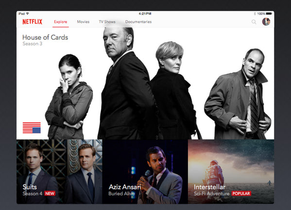
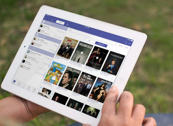
Netflix for iPad by Alex Vanderzon looks like a top-notch project that naturally brings the images into the spotlight. The mockup skillfully balances multimedia, laying it out in a neat grid, and does not overpower users.
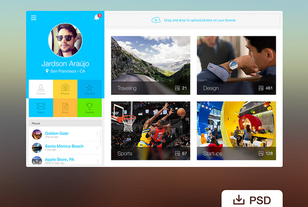
Webapp Profile by Jardson Almeida makes the most out of grid layout that organizes data more effectively, highlights key features and adds to the interface a boxy vibe. Moreover, thanks to a vibrant color scheme, the designer is managed to make the mockup look visually interesting.
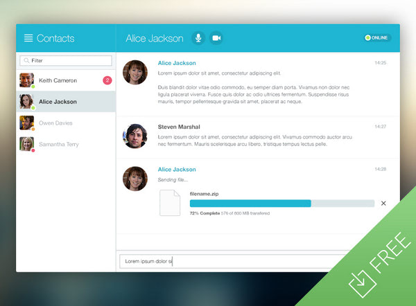
Chat Window App UI by Medialoot has a clean and robust appearance that goes well with lots of projects.2-tone coloring, where blue plays an important role, a ton of white space, well-crafted densely packed navigation sidebar and neat icons greatly add to the user experience.
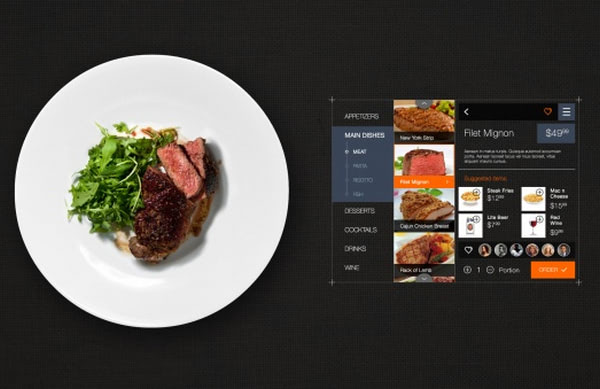
Restaurant Order Interface looks sophisticated and highly exquisite. The prevailing black color that naturally stresses out vibrant images gives a series of yummy photos a number one priority. Grid layout, 2-column body, and distinctive navigation sidebar will not let users get lost.
iOS 7 iTV Show iPad App by Kevin Robe is an elaborate and sophisticated project that capably handles plenty of multimedia through implementing modular layout. Being created on the basis of iOS7, the interface meets Apple’s guidelines and has a subtle and delicate esthetics.
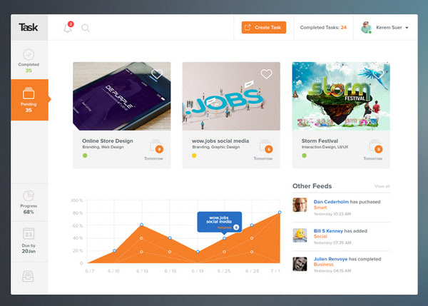
Task by Shab Majeed strikes an optimal balance between images and text, giving the interface a harmonious appearance and marvelous open feeling. The latter takes user experience to the next level, singles out the details and carefully puts accents.
New small freebie by tk is based on a 3-column body that effectively arranges the content and takes the full advantage of flat style. Thanks to hard coloring and a considerable amount of white space, the copy is easily perceived by the readers and can be quickly scanned.
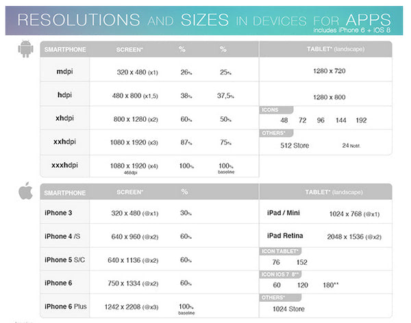
Resolutions and sizes in devices for apps
To finish off our collection we want to boost your workflow with a handy, quite informative and pretty useful table that includes some boring yet integral specifications for app designers/developers. This small cheat sheet shows the resolutions and sizes of various popular devices, including smartphones and tablets powered by Android or iOS.
Conclusion
App mockups, whether it is an interface, which will be operated by the user or a dashboard by means of which an owner will rule the roost should be well-arranged, look visually appealing and present data in non-intrusive manner. Just like the listed above mockups that comply with all these demands, and at the same time, serve as a kind of ‘lodestar’ and a set of pre-defined instruments.