Flexbox and CSS Grid can build most of the same layouts, which is why the question of which to use keeps coming up. The usual answer, “Flexbox is one-dimensional, Grid is two-dimensional,” is true but not much help when you are staring at a navbar or a row of cards.
So we built five common layouts both ways, from the same HTML: a navbar, a card grid, a full page, a form and an image gallery. Then we measured the results at 375, 768 and 1280 pixels wide in Chrome 156, Firefox 160 and WebKit 27.2 (Safari’s engine). All three browsers produced identical measurements. You can switch every demo between the two methods on our live demo page.
The Short Answer
- Flexbox lays items out in one direction and lets their content decide the sizes. Use it for rows of things whose widths vary: navbars, toolbars, buttons with icons, tags, a search box with its button.
- Grid defines rows and columns first and places items into them. Use it when things must line up in both directions: card grids, page layouts, forms with labels, dashboards.
- Most real pages use both: Grid for the page and the card grid, Flexbox inside each card and in the header.
- In our five tests, Flexbox won one (navbar), Grid won three (cards, page, form) and the gallery depends on the look you want.
Same Layout, Both Ways
Each demo below uses identical HTML in both versions; only the CSS changes. The screenshots come from Chrome, and the numbers matched in Firefox and WebKit.
1. Navbar: Flexbox
/* Flexbox */
.nav { display: flex; flex-wrap: wrap; align-items: center; gap: 8px 20px; }
.nav .links { display: flex; flex-wrap: wrap; gap: 16px; }
.nav .cta { margin-left: auto; }

/* Grid */
.nav { display: grid; grid-template-columns: auto 1fr auto; align-items: center; gap: 8px 20px; }
.nav .links { display: grid; grid-auto-flow: column; justify-content: start; gap: 16px; }
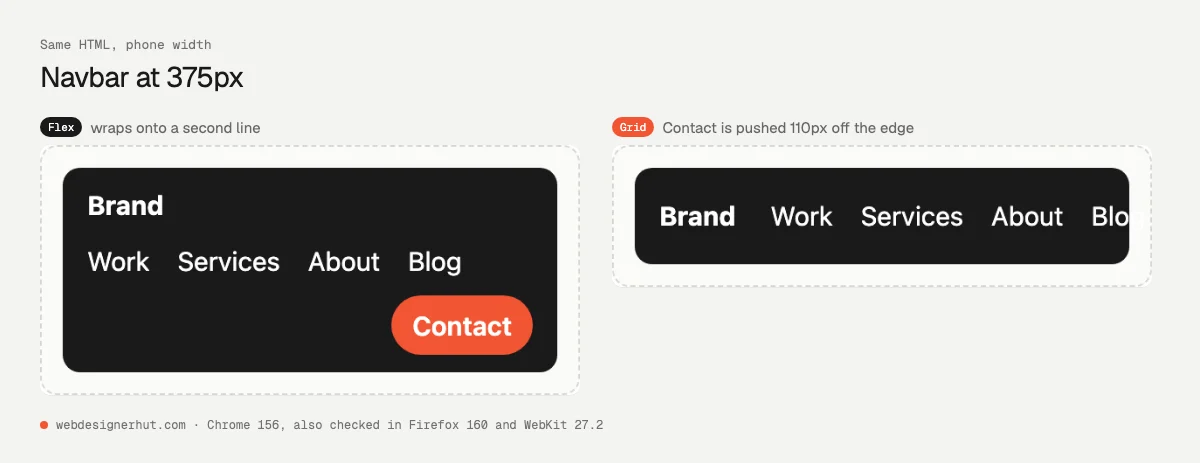
At 768 and 1280 pixels the two look identical. At 375 pixels they don’t. The Flexbox navbar wraps onto a second and third line and grows from 55 to 117 pixels tall, with the Contact button still inside. The Grid navbar stays 55 pixels tall because grid columns don’t wrap, and the Contact button ends up 110 pixels past the right edge.
You can fix the Grid version with a media query, but Flexbox handles it with no extra code. margin-left: auto on the last item is the classic Flexbox trick for pushing it to the far end.
Verdict: Flexbox. The items are content-sized and should wrap when space runs out.
2. Card Grid: Grid, with subgrid
/* Flexbox */
.cards { display: flex; flex-wrap: wrap; gap: 16px; }
.card { flex: 1 1 220px; display: flex; flex-direction: column; }
.card a { margin-top: auto; align-self: flex-start; }

/* Grid */
.cards { display: grid; grid-template-columns: repeat(auto-fill, minmax(220px, 1fr)); gap: 16px; }
.card { display: grid; grid-row: span 3; grid-template-rows: subgrid; row-gap: 0; }
.card a { align-self: end; justify-self: start; }
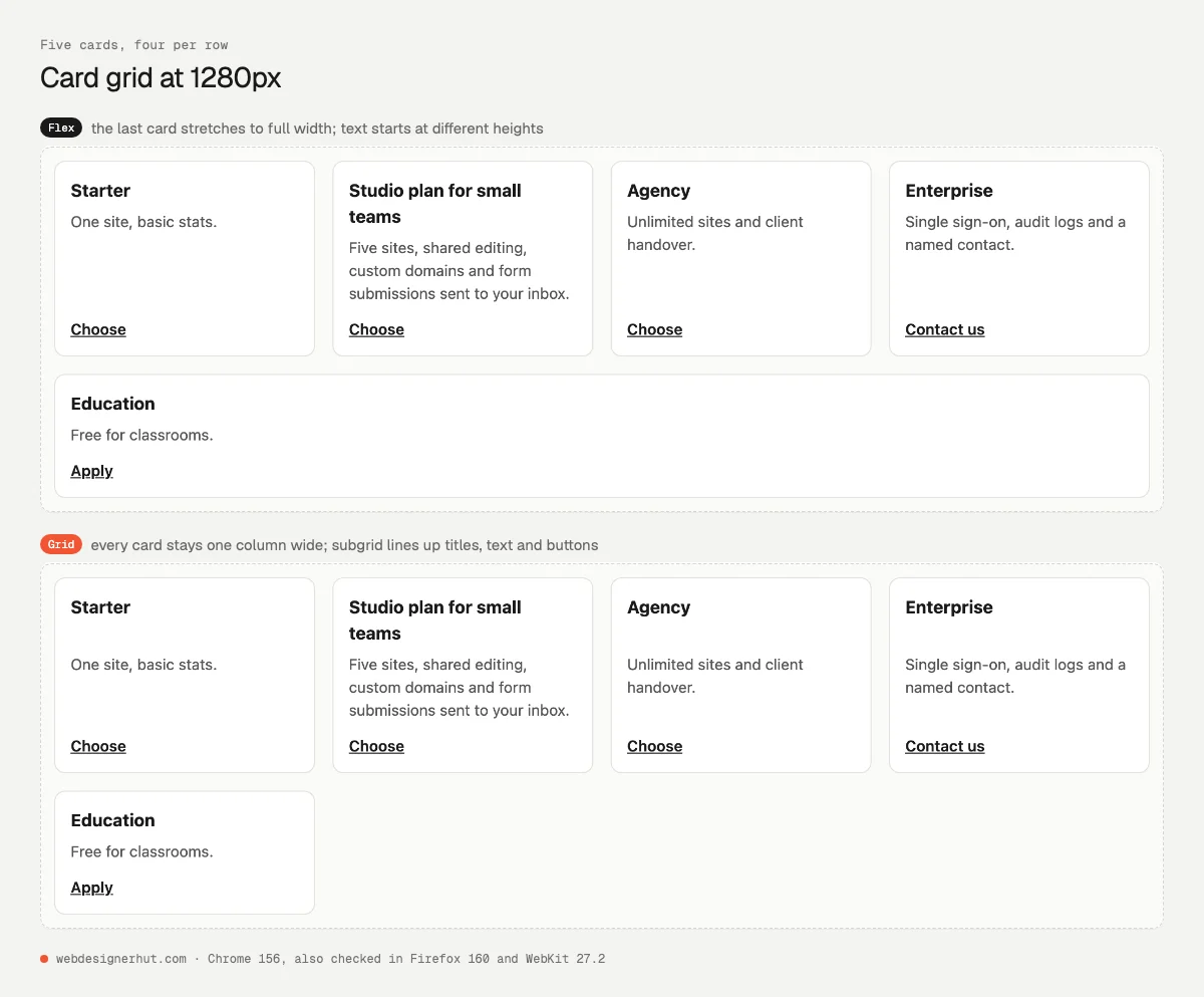
This is the clearest difference in the set. At 1280 pixels both versions fit four cards per row, 240 pixels each. With Flexbox, the fifth card is alone on the second row, and flex-grow stretches it to 1,008 pixels. With Grid it stays 240 pixels wide, in the first column, because columns are defined by the container rather than by the items.
The second difference is inside the cards. One title, “Studio plan for small teams,” wraps onto two lines. With Flexbox, that card’s description starts 69 pixels from the top while the others start at 45. With subgrid, each card borrows three rows from the parent grid, so all four titles share one row height. Every description starts at 69 pixels and every button lines up.
Verdict: Grid. Use repeat(auto-fill, minmax(…, 1fr)) for the columns and subgrid to line up what’s inside.
3. Holy-Grail Page: Grid
/* Grid */
.page {
  display: grid; gap: 12px; grid-template-columns: 1fr;
  grid-template-areas: "header" "nav" "main" "aside" "footer";
}
.middle { display: contents; }
header { grid-area: header; } nav { grid-area: nav; } main { grid-area: main; }
aside { grid-area: aside; } footer { grid-area: footer; }
@media (min-width: 700px) {
  .page {
    grid-template-columns: 180px 1fr 180px;
    grid-template-areas: "header header header" "nav main aside" "footer footer footer";
  }
}

/* Flexbox */
.page { display: flex; flex-direction: column; gap: 12px; }
.middle { display: flex; flex-direction: column; gap: 12px; }
@media (min-width: 700px) {
  .middle { flex-direction: row; }
  nav, aside { flex: 0 0 180px; }
  main { flex: 1; }
}
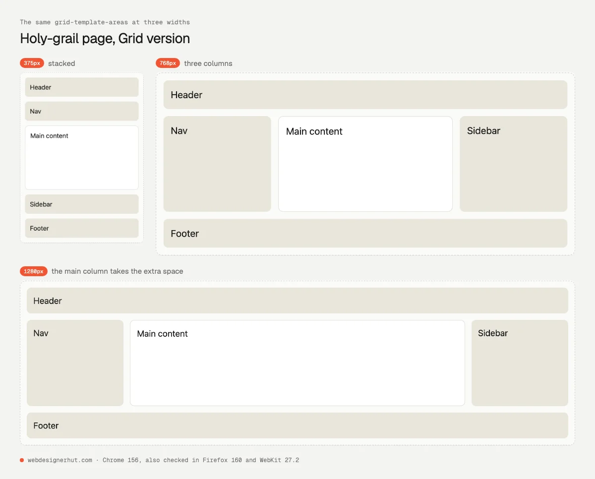
Both versions produce the same boxes at every width we tested: a 180-pixel nav and sidebar with the main column taking the rest. The difference is in what the code needs. Flexbox needs the extra .middle wrapper to create the three-column row, and any change to the layout means changing the HTML. Grid ignores the wrapper (display: contents), and the whole layout is readable in the grid-template-areas strings. Moving the sidebar to the left, or below the main content on phones, is a one-line change to the template.
Our first Flexbox version had a bug worth knowing about. We set flex: 0 0 180px on the nav and sidebar for all screen sizes. On phones, where .middle is a column, flex-basis applies to height, so the nav and sidebar became 180 pixels tall. flex-basis always follows the main axis, so it now lives inside the media query.
Verdict: Grid. Page layout is two-dimensional, and named areas keep it readable.
4. Form with Labels: Grid
/* Flexbox: one row per field */
.row { display: flex; flex-wrap: wrap; align-items: center; gap: 6px 12px; }
label { flex: 0 0 120px; }
input { flex: 1 1 200px; }
button { margin-left: 132px; }

/* Grid: the whole form is one grid */
.form { display: grid; grid-template-columns: max-content minmax(0, 1fr); align-items: center; gap: 10px 12px; }
.row { display: contents; }
button { grid-column: 2; justify-self: start; }
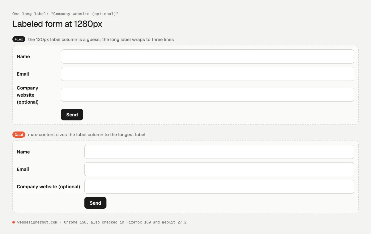
With Flexbox, each row is its own container, so the rows don’t know about each other. To line up the inputs you must give every label the same fixed width. We guessed 120 pixels, and “Company website (optional)” wrapped onto three lines, 63 pixels tall. With Grid, the labels form one column sized by max-content, which made it 190 pixels wide to fit the longest label. All three inputs then start at the same point, 202 pixels in, on one line each.
Flexbox still wins inside a single row, such as a search box with a button: input { flex: 1 } is all it takes.
Verdict: Grid for forms with labels beside fields; Flexbox for a single inline row.
5. Gallery: It Depends on the Look
/* Flexbox: justified rows */
.gallery { display: flex; flex-wrap: wrap; gap: 8px; }
.gallery li {
  flex-grow: calc(var(--w) / var(--h) * 100);
  flex-basis: calc(var(--w) / var(--h) * 140px);
  aspect-ratio: var(--w) / var(--h);
}
.gallery::after { content: ""; flex-grow: 999; }

/* Grid: tiles with spans */
.gallery { display: grid; grid-template-columns: repeat(auto-fill, minmax(120px, 1fr));
           grid-auto-rows: 150px; grid-auto-flow: dense; gap: 8px; }
.gallery li.wide { grid-column: span 2; }
.gallery li.tall { grid-row: span 2; }
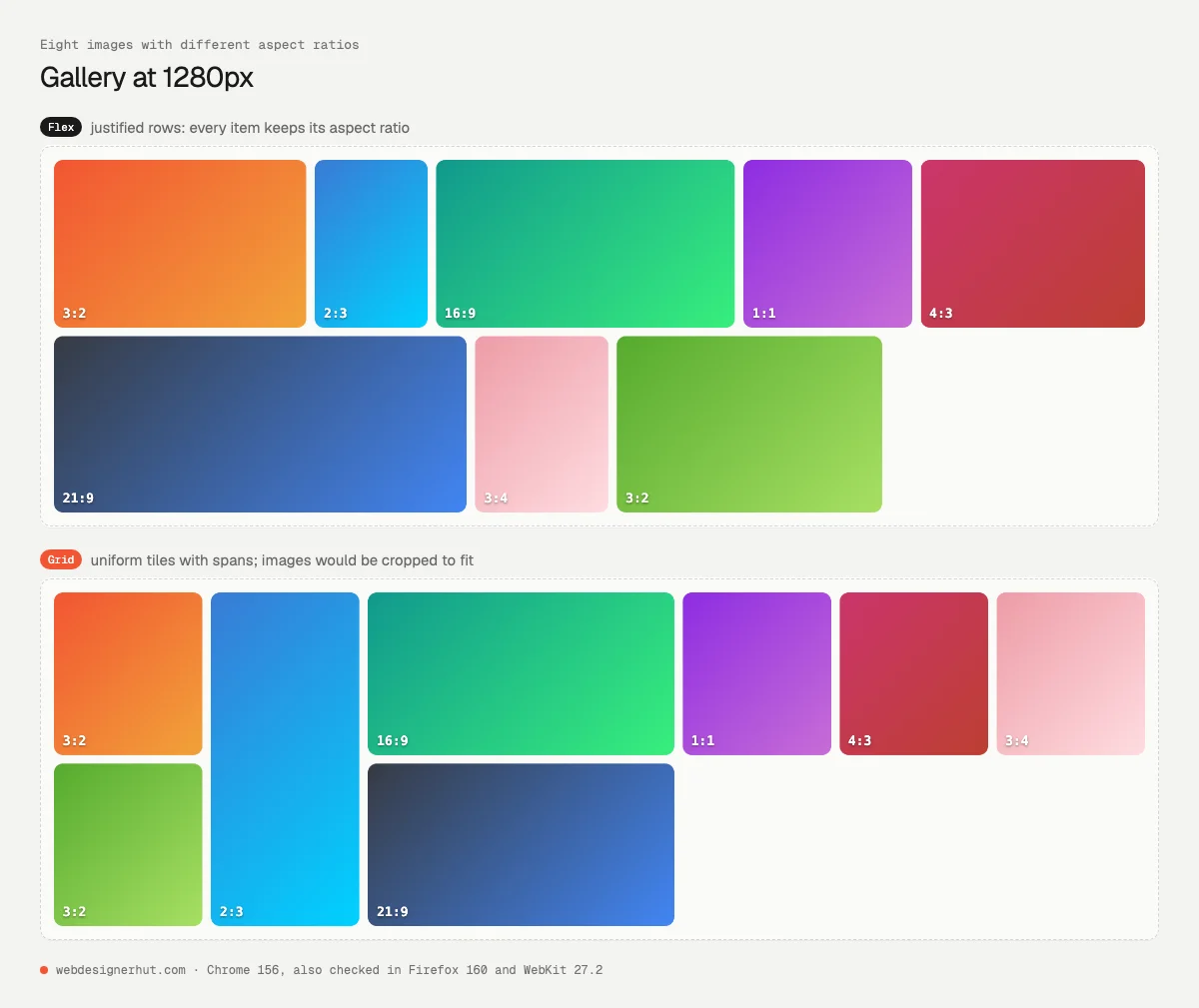
Here each tool wins a different style. The Flexbox version builds justified rows, the layout photo sites use: each item’s flex-grow is proportional to its aspect ratio, so a row fills the width while every image keeps its shape. At 1280 pixels the eight items settled into two rows, 155 and 164 pixels tall. The ::after trick stops the last row from stretching.
The Grid version makes a tidy mosaic of equal tiles, with chosen items spanning two columns or rows, but images are cropped to fit. Two gotchas came up. grid-auto-flow: dense fills gaps by moving items out of source order, which can confuse keyboard users. And with our first column setting, a 150-pixel minimum, the phone layout had a single column, so the span 2 items created a 38-pixel phantom column. Lowering the minimum to 120 pixels gives two columns on phones and fixes it.
Verdict: Flexbox for justified photo rows; Grid for uniform tiles.
Where Flexbox Wins
- Rows of items whose sizes come from their content: navigation links, buttons, tags, breadcrumbs.
- Anything that should wrap naturally when space runs out, without media queries.
- Pushing one item to the end with
margin-left: auto, or centering a single item in both directions. - Distributing leftover space in proportion, as in the justified gallery.
- Layouts inside a component, such as a card’s icon, title and badge.
Our older guide to mastering Flexbox covers every property, and the responsive 2-column layout tutorial shows a complete page built with it.
Where Grid Wins
- Anything that must line up across rows and columns: cards, tables of content, dashboards, forms.
- Page layouts, where
grid-template-areasmakes the structure readable and easy to rearrange. - Keeping the same column width for every item, including the last row.
- Aligning the inside of sibling components with
subgrid, such as card titles, text and buttons. - Overlapping items by placing them in the same cell, without absolute positioning.
For column systems in general, see our article on grid systems. If you prefer to sketch a grid visually, the tools in our CSS generators roundup write the code for you.
Using Both Together
You rarely choose one for a whole site. On this site, the article header that puts the title beside the image is a grid, the top bar is a flex row, and “Related posts” is a grid. The previous and next links under each article are a two-column grid, and each of those links is a flex row holding a thumbnail and a title. A typical split:
.page   { display: grid; grid-template-areas: "header" "main" "footer"; }  /* page */
.header { display: flex; align-items: center; gap: 16px; }                 /* header row */
.cards  { display: grid; grid-template-columns: repeat(auto-fill, minmax(240px, 1fr)); gap: 24px; }
.card   { display: flex; flex-direction: column; }                         /* inside each card */
A simple rule: start with Grid for the container that holds the layout, and Flexbox for small groups inside it. Our responsive layout with HTML and CSS tutorial puts that together on a full page.
Browser Support and Gotchas
Both are safe to use everywhere today. Two newer features are worth checking against your audience, per MDN’s compatibility data:
gapin Flexbox: Chrome 84, Firefox 63, Safari 14.1. Before that, people used margins.subgrid: Firefox 71, Safari 16, Chrome 117 (September 2023). In older browsers the card falls back to an ordinary grid: the content still shows, it just doesn’t line up with its neighbors.
Gotchas we hit while building the demos, all reproduced in three browsers:
flex-basissets height, not width, whenflex-directioniscolumn.- Grid columns don’t wrap. A fixed
auto 1fr autorow will overflow on narrow screens. - A
span 2item in a one-column grid creates an implicit extra column. grid-auto-flow: densechanges the visual order but not the tab order.display: contentsremoves the wrapper’s box. Don’t use it on elements that need their own semantics, like buttons or list items, as older browsers dropped them from the accessibility tree.- Flex items have
min-width: auto, so a long word or URL can push a flex item wider than its share. Addmin-width: 0to the item. In Grid, useminmax(0, 1fr)as we did in the form.
FAQ
Should I use Flexbox or Grid?
Use Grid when items must line up in rows and columns, and Flexbox when items sit in one row or column and their content decides their size. Most pages use both.
Is Grid replacing Flexbox?
No. They solve different problems and are designed to work together. Neither is deprecated.
Is CSS Grid slower than Flexbox?
Not in any way you will notice on a normal page. Choose by layout, not speed.
Can Flexbox make a grid of cards?
Yes, with flex-wrap, but the last row will stretch unless you add workarounds, and the contents of neighboring cards won’t line up. Grid does both without workarounds.
What is subgrid?
A value for grid-template-rows or grid-template-columns that lets a grid item use its parent’s tracks. It lines up content across sibling components, such as titles in a row of cards. All major browsers support it.
Can I use Grid and Flexbox in the same element?
Not on the same element, since it has one display value, but a grid item can be a flex container and the other way round.