Ask a coding agent for a landing page and you usually get the same page: a purple gradient, rounded cards inside rounded cards, a soft glow under every button and an emoji where an icon should be. The agent is not short of skill. It simply has no design system to follow, so it falls back on the average of everything it has seen.
A DESIGN.md file fixes that. It is a single file in your project that tells the agent which colors, fonts, sizes, spacing and corners it may use, and why. This guide explains what goes in one, how to start from a free ready-made theme, and how to get Claude Code, Cursor or any other agent to stick to it.
What Is DESIGN.md?
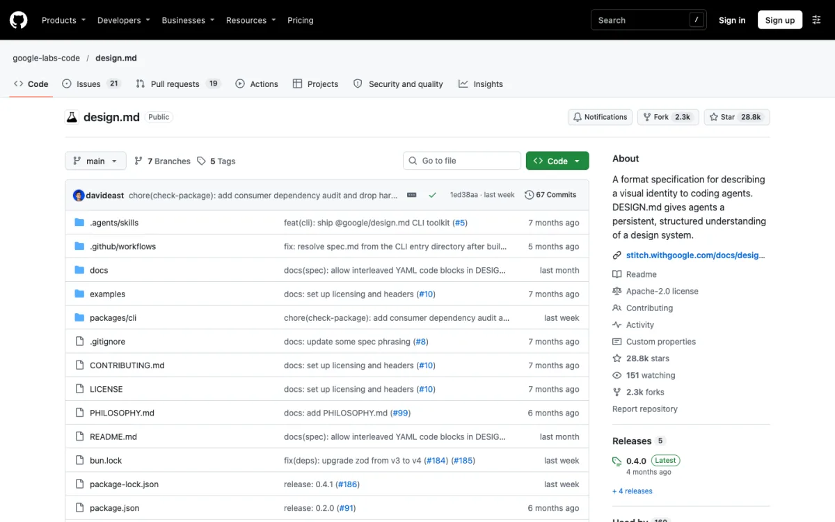
DESIGN.md is an open format from Google Labs for describing a visual identity to coding agents. Google introduced it on April 21, 2026, as part of its Stitch design tool, and published the specification as a draft on GitHub under the Apache 2.0 license, so any tool can read and write it.
The file has two parts:
- Tokens in YAML front matter: colors, typography, corner radii, spacing steps and component styles. These are exact values an agent can copy.
- Prose in Markdown sections: what the design is for, when to use each color, what to avoid. This is the reasoning an agent needs to make decisions the tokens don’t cover.
Think of it as the design counterpart to CLAUDE.md or AGENTS.md, which tell an agent how your codebase works. DESIGN.md tells it how your product should look.
What You Need
- A coding agent that reads files in your project: Claude Code, Cursor, Codex, Copilot or similar.
- A web project. The fastest route below uses shadcn/ui with Tailwind CSS, but DESIGN.md itself works with any stack.
- A theme to start from, or about an hour to write your own.
Step 1: Pick a Starting Theme
Writing a good design file from scratch takes practice, so it helps to start from one that already works. Strict Themes publishes thirteen free DESIGN.md themes, each built for a different kind of product, under the MIT license.
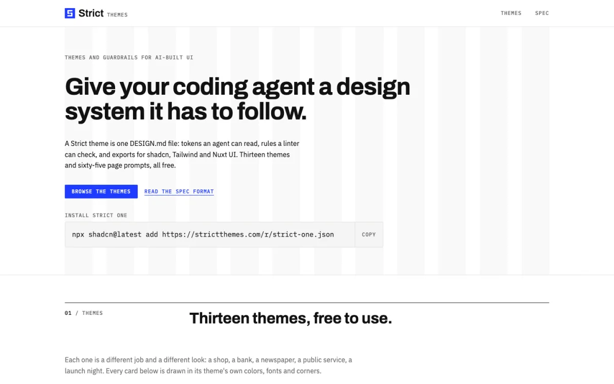
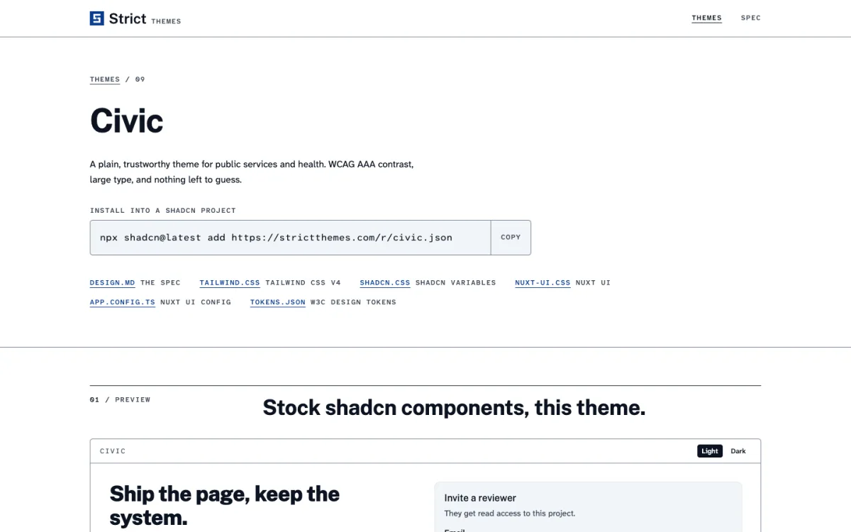
Each theme is aimed at a job, not just a color scheme. Strict One is a Swiss-grid editorial look for software products, Ledger is for money and reports, Kiln for shops and studios, Dispatch for news, Civic for public services, Avion for dashboards, and so on. Every card on the site is drawn in its own theme’s colors, fonts and corners, so you can compare them at a glance.
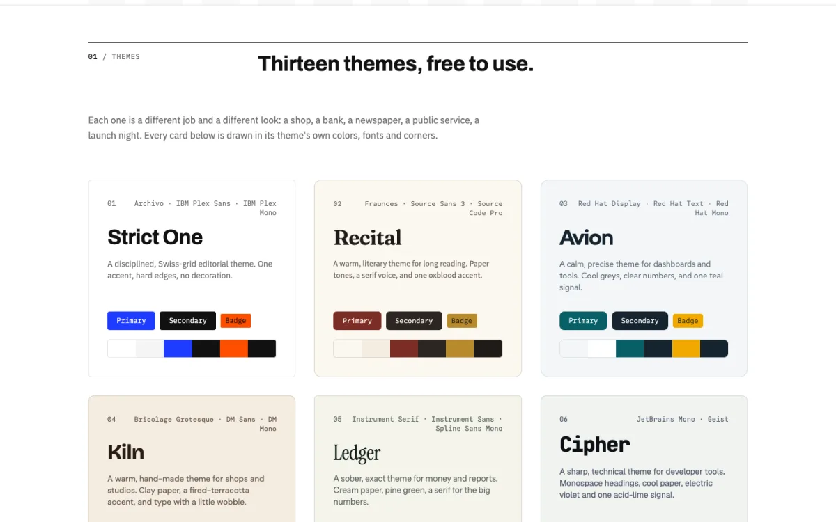
Choose by what you are building, then by taste. A public-service form needs Civic’s high contrast more than it needs personality; a pottery shop is better served by Kiln’s warm paper and terracotta.
Step 2: Install the Theme
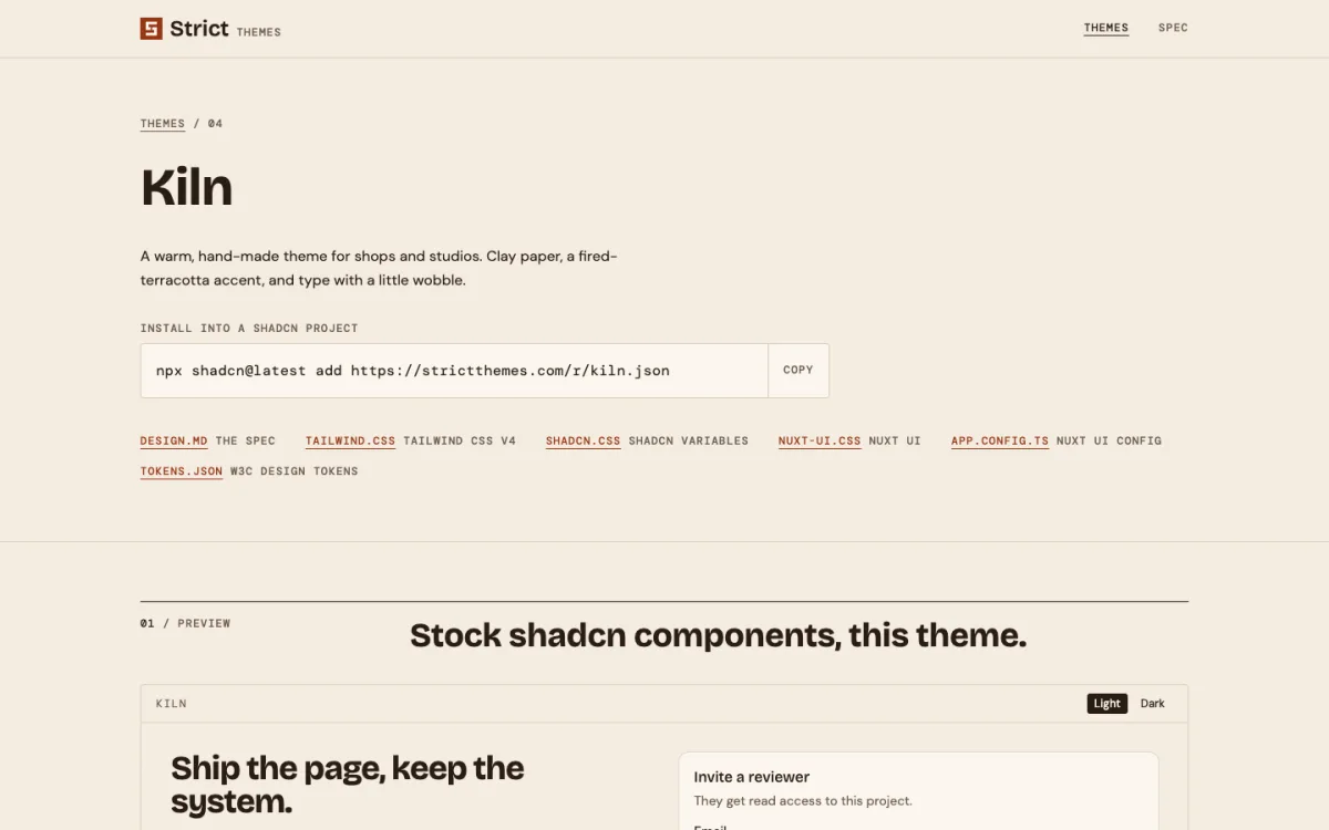
Every theme page shows a one-line install command for a shadcn project. For Strict One it is:
npx shadcn@latest add https://strictthemes.com/r/strict-one.jsonThis adds the theme’s colors, radius and type scale to your global CSS as shadcn variables, in light and dark mode, and installs its fonts. Your existing shadcn components pick up the new look without any changes.
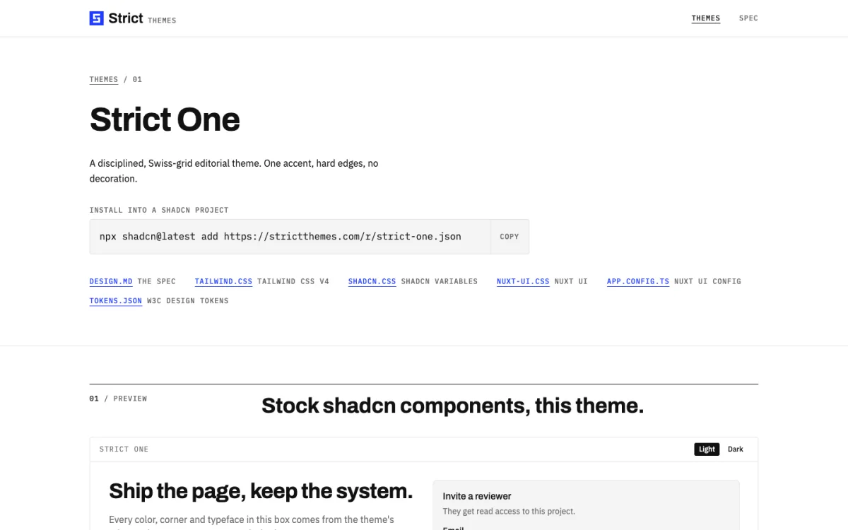
Not using shadcn? The same page links to other formats:
tailwind.css: a Tailwind CSS v4@themeblock.shadcn.css: the theme as plain:rootand.darkCSS variables.nuxt-ui.cssandapp.config.ts: for Nuxt UI.tokens.json: W3C Design Tokens format, for Figma plugins and token pipelines.
Two details from the install notes are worth doing straight away. First, a new shadcn project imports the Geist font; remove that import if the theme brings its own fonts, or you load both. Second, themes that add type classes such as text-h1 or text-label need shadcn’s cn() helper taught that those are font sizes, not colors. Otherwise cn("text-label text-muted-foreground") silently drops one of the two. The CLI prints the exact code for lib/utils.ts after the install.
Step 3: Put DESIGN.md in Your Project Root
The CSS install gives you the tokens, but the agent also needs the reasoning. Download the theme’s DESIGN.md (linked on its page) and save it in the root of your project, next to package.json.
Then make sure your agent actually reads it. Most agents load an instructions file automatically, so add one line there:
# CLAUDE.md or AGENTS.md
Read DESIGN.md before any UI work. It is the source of truth for colors,
type, spacing and corners. Use only its tokens.
This matters more than it looks. Without it, an agent may read DESIGN.md once, then drift back to its habits ten files later. With it, the file is in context for every UI task.
Step 4: Read What the File Tells the Agent
Open the DESIGN.md and skim it before you hand it over. You should agree with what it says, because the agent will follow it literally. A good file covers, in this order:
- Overview: the character of the design in a few sentences. Strict One’s says it should read like a well-set printed page, and that anything decorative should be removed.
- Colors: what each color is for. “Primary is for the one main action on a screen and for links. Never use it for large fills.”
- Typography: the fonts and a short list of sizes, with the rule that hierarchy comes from size and weight, never color. Our guide to good and bad typography covers why a small scale works better.
- Layout: columns, gutters, maximum width and the spacing scale. See our introduction to grid systems if this part is new to you.
- Elevation and shapes: shadows, borders and how round corners may be.
- Components: how buttons, cards, badges and icons should look.
- Do’s and don’ts: the short list an agent checks itself against.
The specific, slightly bossy sentences do the most work. “Never nest a card inside a card” and “Don’t use emoji as icons or bullets” prevent exactly the habits that make AI-built pages look alike.
Step 5: Add Rules a Linter Can Check
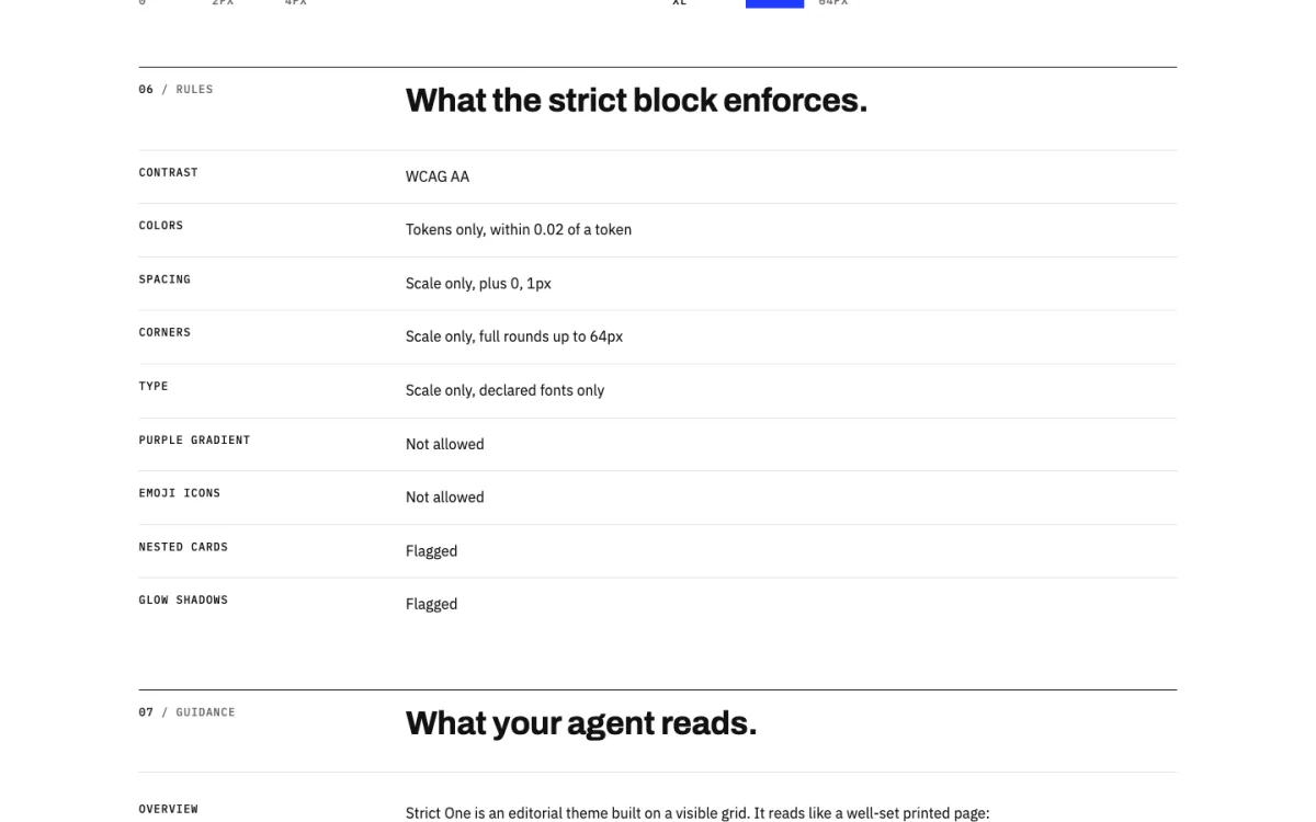
Prose guides the agent, but you cannot test prose. Strict Themes extends DESIGN.md with one extra top-level key, strict, that turns the design into checkable rules. Because the format treats unknown keys as warnings, a Strict theme is still a valid DESIGN.md for any other tool.
strict:
  version: 1
  contrast: AA            # WCAG AA (4.5:1) or AAA (7:1)
  colors:
    allow: tokens         # only colors defined above
    tolerance: 0.02
  spacing:
    allow: scale          # only spacing steps, plus...
    extra: ["0", "1px"]
  rounded:
    allow: scale
    full: 64px            # pills and circles only up to 64px
  typography:
    allow: scale
    fonts: declared
  tells:                  # signs of generic AI-made UI
    purple-gradient: error
    emoji-icons: error
    nested-cards: warn
    glow-shadows: warn
The tells section is the interesting part: it names the patterns that give away AI-generated UI and decides whether each one is an error or a warning. The theme page shows the rules in plain language.
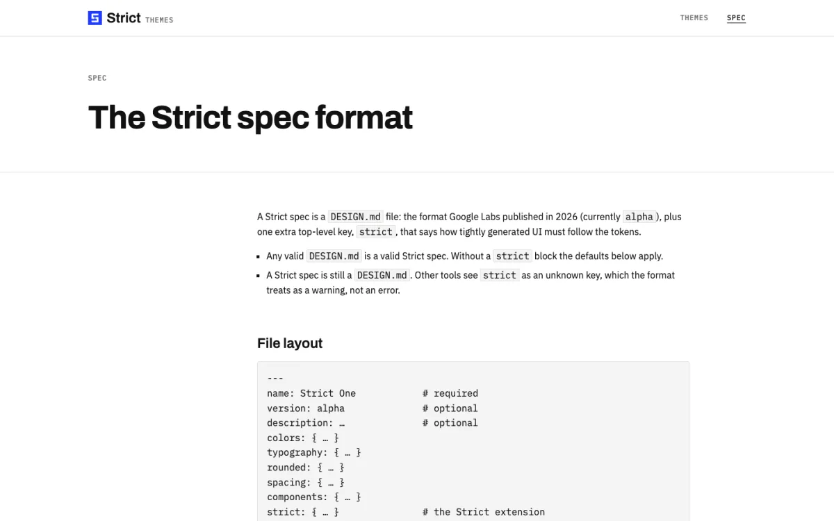
The full format, with every lint rule and how each export maps tokens to shadcn, Tailwind and Nuxt UI, is documented on the Strict spec page.
strict block.Step 6: Ask for Pages with a Full Brief
“Build me a pricing page” leaves the agent to guess the layout. A brief that names the sections, the behavior and the checks gets much closer on the first try. Each Strict theme comes with five such page prompts, for example a landing page, pricing page, article, docs page and dashboard for Strict One, or a shop home, collection, product, basket and studio page for Kiln.
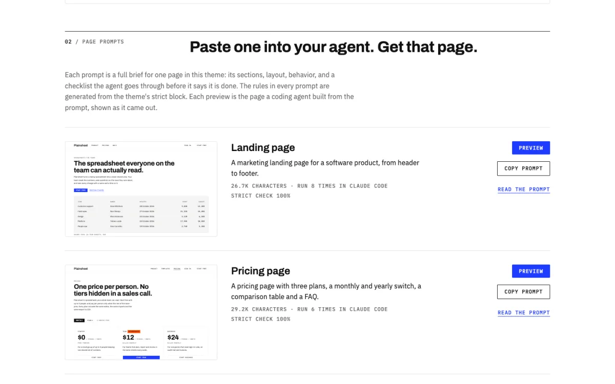
The prompts are long (around 27,000 characters for the Strict One landing page) because they spell everything out. They are worth reading even if you write your own, as a model of a good brief:
- Before you start: check the theme is installed, read DESIGN.md in full, and use the project’s existing components instead of writing new ones.
- The page: each section in order, from header to footer, with what goes in it.
- Rules: generated from the theme’s
strictblock, plus its do’s and don’ts. - Check before you finish: a checklist the agent runs against its own code, such as one
<h1>, no hard-coded hex colors, every gap on the spacing scale, AA contrast in both modes and no sideways scroll at 375px. It then reports which checks pass and which it could not verify.
That last section is the one to copy into your own prompts. Asking the agent to verify its work against named rules catches far more than asking it to “make it look good”.
Step 7: Review the Result
An agent that follows a design file still makes mistakes, so check the output yourself:
- Search the code for raw colors. Any hex,
rgb()or Tailwind palette class such asbg-purple-500means the agent stepped outside the tokens. - Search for arbitrary values. Classes like
p-[13px]orrounded-[20px]bypass the spacing and corner scales. - Toggle dark mode. Contrast that passes in light mode often fails in dark.
- Check the markup. One
<h1>, headings in order, alt text on images. Our guide to semantic HTML for accessibility lists what to look for. - Resize to phone width. Nothing should scroll sideways.
Strict Themes is also building an automated checker, Strict Check (@strictthemes/check), which tests a project’s code and rendered pages against the strict block. The site describes it as a first version, so treat it as a helper alongside your own review rather than a replacement.
Writing Your Own DESIGN.md
Once you have used a ready-made theme, writing your own is straightforward. Start from a theme close to your brand and change it, rather than starting from an empty file:
- Replace the colors. Keep the same roles (primary, secondary, background, surface, foreground, border, error) and give each a “use it for” sentence. A palette tool like Coolors helps you find a set, and the
contrastrule will tell you if a pair fails WCAG. - Keep the type scale short. Five or six sizes is plenty. Every extra size is one more choice the agent can get wrong.
- Use a spacing scale with gaps between steps, such as 4, 8, 16, 32 and 64 pixels, so the difference between steps is visible.
- Write the don’ts from experience. Look at what your agent got wrong last time and forbid it in plain words.
- Reference tokens in components with
{colors.primary}or{spacing.md}instead of repeating values, so a color change updates every component.
If your design already lives in Figma, export the variables first and turn them into tokens. Our guide on going from Figma to HTML covers the hand-off from the other direction.
FAQ
What is a DESIGN.md file?
A Markdown file in your project root that describes your design system for coding agents: design tokens in YAML front matter, plus prose that explains how and when to use them. The format comes from Google Labs and is open source.
Does DESIGN.md work with Claude Code and Cursor?
Yes. Any agent that can read files in your project can use it. To make sure it is read on every task, reference it from the agent’s instructions file, such as CLAUDE.md, AGENTS.md or Cursor’s rules.
Do I need shadcn/ui to use a DESIGN.md theme?
No. shadcn gives the quickest install, but Strict Themes also exports each theme as a Tailwind CSS v4 theme, plain CSS variables, Nuxt UI config and W3C design tokens. The DESIGN.md file itself is framework-independent.
Are Strict Themes free?
Yes. All thirteen themes and their page prompts are free and open source under the MIT license.
How is DESIGN.md different from a design tokens file?
A tokens file only holds values. DESIGN.md holds the same values plus the reasoning: what each color is for, what to avoid and how components should behave. Agents need that reasoning to handle cases the tokens don’t cover.
Why does AI-generated UI all look the same?
Without instructions, an agent falls back on the most common patterns in its training data: purple gradients, nested rounded cards, glow shadows and emoji icons. A design file with explicit tokens and don’ts replaces those defaults with your own.