A background image is one line of CSS. Making it fill a hero without stretching, keep the text on top readable, send small files to phones and not slow the page down takes a few more. This guide covers the properties briefly and then gives you working recipes, each with a live demo you can open and copy.
Every demo uses the same original 1800×1200 illustration, and every behavior described here was checked in Chrome 157 on November 12, 2026: which file image-set() downloads, which background images load before you scroll, and how much a CSS background hero costs in loading time compared with an <img>.
The Basic Syntax
.hero {
  background-image: url("images/dusk.jpg");
}
The path inside url() is relative to the CSS file, not the HTML page. If your stylesheet is in css/ and your images are in images/, write url("../images/dusk.jpg"). Our guide to linking CSS to HTML explains relative paths with a diagram.
An element only shows as much background as its own size, so an empty <div> with a background image shows nothing until you give it a height or content. In practice you will almost always write the shorthand, which sets the image, position, size and repeat in one line:
.hero {
  min-height: 60vh;
  background: #2a1f3d url("images/dusk.jpg") center / cover no-repeat;
}
The color at the start is shown while the image loads, and stays if it fails, so pick one close to the image’s average tone. Note the slash: in the shorthand, the size always comes after the position, separated by /.
Size: Cover vs Contain vs Fixed Values
background-size decides how the image is scaled to its box. Here are six settings on the same image in a box that is squarer than the image:
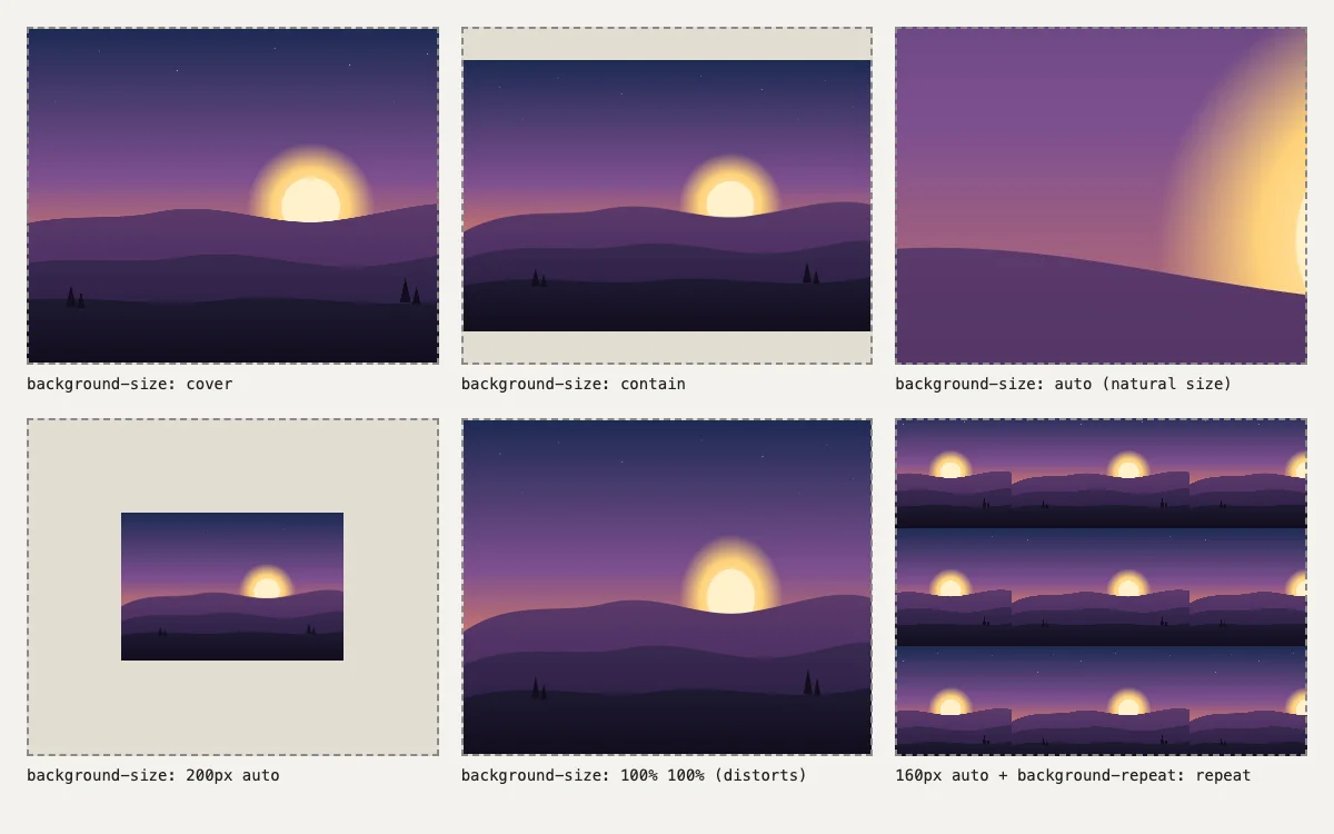
background-size values. Open the demo.coverscales the image until the box is completely filled, cropping whatever overflows. Use it for heroes, banners and cards. It is the right answer most of the time.containscales the image until it fits entirely inside the box, leaving empty bands. Use it for logos or illustrations that must not be cropped.auto, the default, uses the image’s natural size. A large photo will show only its top-left corner, or its center if you also set the position.- Lengths such as
200px autoset the width and keep the proportions. Useful for icons and patterns. 100% 100%stretches the image to the box and distorts it. Avoid it for photos.
Position and Repeat
background-position chooses which part of the image stays visible when cover crops it. Keywords such as center, top or right bottom work, and percentages give finer control: 70% 50% keeps the point 70% across the image in view, which is how you keep a subject that sits right of center from being cut off on narrow screens.
.hero {
  background-position: 70% 50%;   /* keep the sun in view */
}
background-repeat defaults to repeat, which tiles a small image across the box. Set no-repeat for photos. For patterns, repeat, repeat-x and repeat-y tile in both or one direction, and space or round avoid cut-off tiles at the edges.
background-attachment: fixed creates a parallax-like effect by pinning the image to the viewport. Use it carefully: iOS Safari has long ignored it, and it can make scrolling less smooth on low-powered devices.
Recipe: Full-Screen Hero With an Overlay
White text straight on a photo is rarely readable everywhere, because the photo has light and dark areas. The fix is a second background layer: a semi-transparent gradient listed before the image, so it sits on top of it.
.hero {
  min-height: 100vh;    /* fallback */
  min-height: 100svh;   /* fills the screen on phones, even with the address bar */
  display: grid;
  place-items: center;
  color: #fff;
  text-align: center;
  background:
    linear-gradient(rgb(0 0 0 / 45%), rgb(0 0 0 / 45%)),
    url("dusk.jpg") center / cover no-repeat;
  background-color: #2a1f3d;
}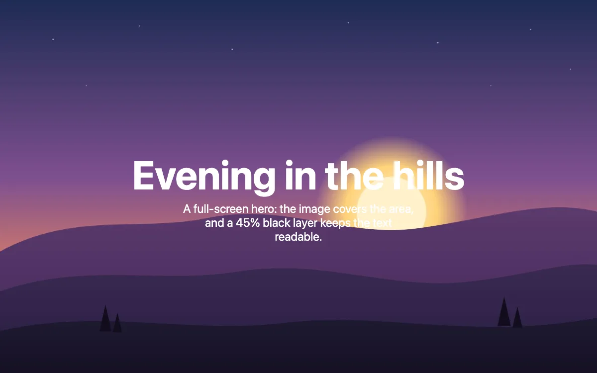
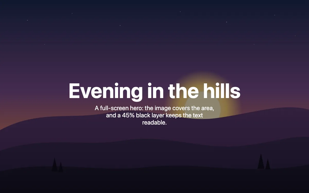
Adjust the 45% until the text passes a contrast check over the brightest part of the image. A gradient that is darker at the bottom, such as linear-gradient(transparent, rgb(0 0 0 / 70%)), keeps more of the image visible when the text sits low. To fade the image itself rather than darken it, see our guide to transparent backgrounds in CSS, which covers the pseudo-element technique, since CSS has no background-opacity property.
Responsive Background Images
An <img> can use srcset to send small files to small screens. For backgrounds you have two tools, and they combine well.
Modern formats with image-set()
image-set() lists alternatives with their file type, and the browser downloads the first one it supports. Keep a plain url() line above it for older browsers:
.banner {
  background-image: url("dusk-900.jpg");   /* fallback */
  background-image: image-set(
    url("dusk-900.avif") type("image/avif"),
    url("dusk-900.webp") type("image/webp"),
    url("dusk-900.jpg")  type("image/jpeg")
  );
}
Different files for different screens
Wrap a second rule in a media query to send a larger file to wide screens, or a differently cropped one to phones (called art direction):
@media (min-width: 900px) {
  .banner {
    background-image: url("dusk.jpg");
    background-image: image-set(
      url("dusk.avif") type("image/avif"),
      url("dusk.webp") type("image/webp"),
      url("dusk.jpg")  type("image/jpeg")
    );
  }
}
We tested this in Chrome 157 with the network log open: at 1440 pixels wide it downloaded only dusk.avif, and at 375 pixels only dusk-900.avif. Neither the JPEG nor the WebP was requested. The demo prints the file your browser chose.

For our illustration, the 1800-pixel files were 37 KB as JPEG, 13 KB as WebP and 11 KB as AVIF. Flat illustrations compress unusually well, so expect smaller gaps with real photos, but AVIF and WebP are usually much smaller than JPEG at similar quality. If you need free photos to try this with, see our list of free stock photo sites.
Performance: Lazy Loading, LCP and When to Use <img>
Background images cannot be lazy-loaded with an attribute
loading="lazy" works on <img> and <iframe>, not on CSS. We checked what Chrome actually downloads on page load, without scrolling:
| Test page | Image downloaded on load? |
|---|---|
Background on a div 4,000 px below the fold | Yes, straight away |
Background on a div with display: none | No |
<img loading="lazy"> 4,000 px below the fold | No, only when scrolled near |
So a long page full of decorative backgrounds downloads all of them up front. To defer them, add the background with a class when the section comes into view, using an IntersectionObserver, or use an <img> with loading="lazy" and object-fit: cover instead.
A CSS background hero is slower than an <img> hero
Browsers start downloading <img> files as soon as they read the HTML. A background image is only discovered after the stylesheet has downloaded and the browser has worked out which elements use it. For a hero, which is usually the page’s Largest Contentful Paint (LCP), that delay counts.
We built three versions of the same page with the same 207 KB, 1800×1200 JPEG hero and an external stylesheet, served them locally, and ran Lighthouse 10.4 in mobile mode with DevTools throttling, five runs each. Medians:
| Hero technique | LCP (median of 5) |
|---|---|
<img fetchpriority="high"> with object-fit: cover | 2.30 s |
CSS background-image | 2.88 s |
CSS background-image plus <link rel="preload" as="image"> | 2.31 s |
The CSS background was about 0.6 seconds slower, and preloading the image closed the gap almost entirely. The preload tag goes in the <head>:
<link rel="preload" as="image" href="images/dusk.jpg" fetchpriority="high">If you use image-set() or media queries, a single preload no longer matches what the browser will choose; imagesrcset and media attributes on the preload tag can mirror them, but at that point an <img> with srcset is simpler.
When to use <img> instead
- The image is content, such as a product photo or a person, and needs alt text for screen readers and search engines. Background images have neither.
- It is the hero or the LCP element and you do not want to manage preloads.
- It is far down a long page and should be lazy-loaded.
Keep CSS backgrounds for decoration: textures, patterns, gradients and images behind text that only set a mood. For layouts that adapt to phones, our guide to mobile web design covers the rest of the picture.
FAQ
Why is my background image not showing?
The three usual causes: the path in url() is wrong because it is relative to the CSS file, the element has no height, or another rule overrides it. Check the Network tab in DevTools for a 404, and the Styles panel for a crossed-out rule.
How do I make a background image fit the screen?
Give the element min-height: 100svh (with 100vh as a fallback) and use background-size: cover with background-position: center.
How do I change the opacity of a background image?
There is no background-opacity. Put a semi-transparent gradient layer over the image, as in the overlay recipe, or put the image on a ::before pseudo-element and set its opacity.
Can I use more than one background image?
Yes. Separate the layers with commas in background or background-image. The first layer is drawn on top.
Should I use WebP or AVIF for background images?
Both are widely supported and usually much smaller than JPEG. AVIF is often smaller still. Offer both with image-set() and keep a JPEG fallback.
Do background images hurt SEO?
Not directly, but search engines do not treat them as content images, and a slow-loading hero background can hurt your Core Web Vitals. Use <img> for images that matter.